Featured Post Today
print this page
Latest Post
Showing posts with label Color. Show all posts

Colors in Visual Communication & Everyday Life

Colors in Visual Communication & Everyday Life
Contribution of Colors in Visual Communication & Everyday Life - investigated the use of color as the essence of the object to interact with the world. Color is also used as a metaphor and symbolism because of its philosophical value. Understanding the meaning of the colors will strengthen its use in design work.

Colors in Visual Communication & Everyday Life

Color is one element that can not stand alone. Appearance of a color is always influenced and determined by the other colors around it. Color is also the first physical appearance to our eyes that distinguish something with something else, either inanimate objects or living things. We can see the color because of the interaction, or because there is interplay between the colors themselves. Blue color with the same lighting levels will look different appearance when placed on a different background or brought closer by a different color.

Colors in Visual Communication & Everyday Life

Color-related articles:
  1. Color Trends 2012 | Popular colors in 2012
  2. Tools for Choosing Color Combinations for Your Designs
  3. Color Psychology in Branding & Marketing
  4. 5 Important Points to Know About Color Theory
  5. Identify Color Harmonies with ColorSchemer Studio

Each color will create a different impression. By understanding the various things about the color, it will be easier for you to get a proper view of the full color itself, as caused by the color shades are very diverse, and the impression generated is also very diverse. From a wide range of colors available, as the most basic colors are red, blue, and yellow. Of the three colors can be converted into thousands of colors by mixing in certain comparisons in accordance with the desired colors.

Colors in Visual Communication & Everyday Life

As a result of mixing these colors will cause a reaction in the direction toward the dark and light in our eyes. The colors are mixed with blue will produce a dark color. While the colors are mixed with yellow and red will produce a lighter color. Such as having a yellow base color and yellow cadmium yellow lemon. Both are impressively different impression. Lemon color will seem soft, whereas cadmium seemed harder. So also in blue. There are several types of blue such as cobalt blue, ultra blue, marine blue, Prussian blue, cyan blue, etc.

Colors in Visual Communication & Everyday Life

Blue color when mixed with green color with a certain ratio would give the impression of cool. Cooler impression can be obtained by mixing blue with a slight purple color as in Prussian blue. Green color which contain a mixture of yellow will impress warmer than blue. Purple when mixed with the red will impress warm. Heat and light impression gained from mixing red and yellow. When red is mixed with blue or purple would be cool. When the yellow mixed with green or blue would seem cool. When the colors are mixed with white will obtain pastel colors that give the impression of comfortable, lightweight, soft and cool. When they are mixed with gray, it will cause distress and veiled impression.

Colors in Visual Communication & Everyday Life

Dark colors and bright colors will create a different impression. Dark color to your eyes will be analyzed by the brain, and produces the impression of cold. So in contrast with the bright colors will feel warm and hot. As we learned in physics where the red wavelengths are longer than the purple wave. That means a red color which is bright and hot, can more quickly caught the eye, rather than the color purple which seemed dark and cold. The colors which are categorized as hot colors are: yellow-green, yellow, orange yellow, orange, reddish orange and red. The colors which are categorized as cool colors are green, turquoise, blue, purple and violet blue.

COLOR AND MATERIAL

Interior

Colors in Visual Communication & Everyday Life

In layout and interior, color and materials affect each other. Although each type of material already has its own character, but it also still needs finishing touches. The final touch is the coloring. For example, the color gives the impression of the clothes, so that the material looks striking, and its shape is more clearly visible. Sometimes the color can also obscure the character of the material.

The use of wood-based material which is given a touch of color will disguise the wood fibers. The use of color can also preserve the material, such as the use of color on ferrous materials that can prevent iron from rusting. The resulting effect of a color is to determine the look of a room and decorate furniture. Proper use of color will accentuate the shape and cover the deficiencies.

COLORS AS SYMBOLS

Black is for grief

Colors in Visual Communication & Everyday Life

There are certain colors that can represent our feelings. Such as grief, it's unethical if we wear clothes that are patterned or brightly colored. Because the bright color is a bright representative of the feelings, or excited. To represent it we usually wear black, because black is figured as death or deterioration. Death is not always represented by black. Death is a spiritual path leading to the higher degree, ie immortality.

Then the death can also be symbolized by the color white. Since white is a symbol of eternity, peace, happiness and purity. According to some tribal belief, black and white are two colors that have the highest degree. Of the colors of life begins, then proceed. White means pure, peaceful, clean, and black means strength and determination.

Grief is the opposite of happiness. People are always shrouded in a sense of happiness is when their days are filled with feelings of love. Love of neighbor and in the surrounding environment. Ordinary sense of love is symbolized by the color pink, the more we look at the celebration of Valentine's Day, everything was pink. Starting from the windows of shops, flower sellers, and sellers Valentine trinkets, knick-knacks, especially the youth needed to express her love to someone.

COLOR AS A PRACTICAL GUIDE

Color in direction, signage, and signal

Colors in Visual Communication & Everyday Life

Color is closely related to the behavior patterns of society. Such as giving instructions to a department, giving instructions and warnings. Traffic light stop signal instructed in red. Caution signs in yellow, and go with the color green.

Of some colors that have been implemented, we can review those aspects of the nature of color appearance. Red, orange, and yellow are hot, look more prominent and stimulating. The meaning of these colors are a danger warning and caution. While the colors green, blue and violet are cool-looking shade that is passive and silent. The significance of these warnings is a safe state.

COLOR, SHAPE AND SPEED

Color in shape and speed

Colors in Visual Communication & Everyday Life

Color is also closely related to the shape and speed. This relationship has been investigated by the International Safety Colour Codes is an institute for occupational safety and traffic in New York, USA In the high-speed, red and yellow colors will be seen faintly.

Green and blue colors will be seen more clearly. Hence the traffic signs on the highway where the usual place to spur high-speed vehicle made ​​a square written with white letters on a green or blue base. Rectangular shape is the form that appears to form a whole, quiet and stable. While the triangular shape sharp, comes with a directional nature. Gives the impression of a circle, rotating and moving.

COLOR AND NATURE

Color in nature

Colors in Visual Communication & Everyday Life

Colors can also be learned from the natural phenomena we encounter in everyday life. Winter is dominated by blue, bluish green, the color of pure white snow, gray and black darkness. Spring is usually characterized by yellowish-green foliage and soft yellow shoots and buds. While in natural conditions on the upper side is dominated by the color blue.

In the summer sun shines full, deep yellow color dominates the field and the yard, the ground is brown. In late summer, the fruit begins to mature so that the trees decorated with red beads. Natural color of autumn begin to dim. The whole nature shrouded in gray mist. The yellow color changed to brown, brick red to red and then to violet.

Color and psychological

Color and human characters

Colors in Visual Communication & Everyday Life

From the standpoint of psychological science, the color associated with the human characters. People with extrovert character usually prefer hot colors and bright. Because that kind of person is usually open, more outward looking than inward, it is not difficult to receive new issues as a way of thinking leads to more aspects of a general than specific. While people with introverted characters may be more comfortable in cool colors and dark. People of this type are usually closed, more inward looking, difficult to accept new issues, preferring to settle on things that are specific rather than general.

Colors can also effect a sense to the viewer. Sun colors like yellow, red, orange and a single tone with it, could lead to a sense of warmth. Instead the cold can be caused by cool colors like blue, greenish blue, white and black.

Light colors like light yellow, light green, pink, bright blue and bright brown gives the impression of a cheerful young at heart. Dark colors like brown, violet, gray and green to give a sense of calm, giving rise to a desire for solitude.

As we have observed that the color of the universe can make it look closer, and away. This impression can be used to give the impression of the room to suggest a wider or vice versa, highlighting or pushing a wall, ceiling or furniture. The walls of a room with a light blue color that leads to gray to give the impression of 'away', so the room becomes more visible area. Instead a dark color such as orange which give the impression of narrowing.

COLOR FOR OCCUPANCY

Color in Room Decoration

Colors in Visual Communication & Everyday Life

To obtain a harmony of color, you should pay attention to the color comparison, is only by combining warm colors with cool colors, light colors with heavy color resulting in a contrasting color. Between bright and dark, clean and opaque, offset by a fastening element.

For example: in a room there is an orange sofa, and a purplish-blue lamp shades, wall and floor are white (the color of lights). So all of these colors will gain a level of brightness of the color white.

In providing color to the room, everything must have a color corresponding to the function. Where the walls and furniture serves as a supporting color. Wall as background, as well as a room divider should be light-colored to suggest away, and do not seem 'pressing'. The floor color must be able to support the furniture that will be arranged within a space. Small furniture can be used as a point of strong color. Of wood furniture is more easily adapted for almost any type of wood containing a neutral gray color.

The colors calm and gentle can be used for bedrooms, because according to its function as a space to relax with a high level of privacy. In the child's bedroom is preferred primary colors are bright, it is in accordance with the conditions of development of the growing child, and energetic.

While the kitchen serves as a practical work space and clean. Cleanliness of a household can be seen from the neatness and cleanliness of its kitchen. It can be applied by placing a white cupboard and a table with warm yellow walls. Brown color of the floor that could create the impression of cool. While the exciting impression can be obtained from red and orange colored kitchen tools.

The family room should exude a cozy warmth. Dark brown sofas combined with red brick on the curtains, and soft brown color on the floor. For color contrast can be obtained by placing some plants in space.

COLOR IN THE BUILDING

Color as a tool to create beauty and comfort of a building

Colors in Visual Communication & Everyday Life

Colors in the building helps to create the appearance of a building. Color is a tool to create beauty and comfort and can also be a pacemaker appearance of a building. Of the colors will talk functionality of the building and the impression you want to display. For example, the hospital building is identical to the color white. White is a symbol of cleanliness and hygiene.

In its development, many hospital buildings that are not always white. Mainly private hospitals that use many colors of soft pastels. This color is used to show the impression of a soft and comfortable, especially for patients who are treated there. And of course the hygienic cleanliness.

Kindergarten schools more dominated by bright colors. This is to create excitement and interest children in learning. There are also several residential buildings that use striking colors of their environment. This is to give a certain identity, and makes it easier for people who are looking for.

Color is a matter of taste and it is relative. That's the nature of color that always gives impression for human life. There is a dark color, light, bright, opaque, heat and cold. All can give color when combined in harmony.

Conclusion


Colors can not be separated from the design world and even of our daily lives. Colors can form mental expression and diversity of language communication. With the principles and color philosophy, we can implement the design work in communicating visually.

Each color can create a different impression. By understanding the various things about the color, will allow us to get a proper view of the full color itself. For shades caused by the color itself is very diverse, and the impression is very diverse-inflicted. From a wide range of colors available, as the most basic colors are red, blue, and yellow. Of the three colors can be converted into thousands of colors by mixing in certain comparisons in accordance with the desired colors.
Fresh Colors Category | Color Characteristics

Fresh Colors Category
The colors that exist in our everyday lives are divided into several groups. Among them is the color that has a refreshing character. Fresh colors are usually preferred by those who are young at heart.

Fresh Colors Category

Some of the colors that have a character that is refreshing when applied to a room it can make the atmosphere more lively, bright, creating an inviting impression, fresh and natural, as well as uplifting. fresh color group is also able to create an impression of fun and improve your mood.

Color-related articles:

  1. Color Trends 2012 | Popular colors in 2012
  2. Tools for Choosing Color Combinations for Your Designs
  3. Color Wheel in Graphic Design
  4. 5 Important Points to Know About Color Theory
  5. Identify Color Harmonies with ColorSchemer Studio
  6. Color Psychology in Branding & Marketing

Fresh Colors Category

Well, what are the colors that go into fresh color group?
See below:

Fresh Colors Category


  • Bluish white which gives the impression of a fresh and clean.
  • Light Yellow cheerful and gentle.
  • Yellow/ lemon / citrus, can create the impression of fun and enthusiasm to socialize, evoke emotion, and energy.
  • Leaf Green, identical to the fresh nature, associated with growth.
  • Lime green, apple green, brings freshness and enthusiasm.
  • Ocean blue, fresh and create a sense of ease.
  • Bright red, symbolizing the spirit, vitality, and courage.
  • Light Pink / pastel, for the impression of calm, soothe, and rejuvenate. Associated with the softness and freshness.

That was Some colors that can be applied to create the impression of fresh, and gives a pleasant feeling in your design.

Color Wheel in Graphic Design

Color Wheel
Colors has a major role in the design work especially in presenting the overall impression of the design work. Therefore, every graphic designer is required to always be creative in using color.

Color Wheel

Color is the most important element that can be captured directly by the senses of sight before another element is realized. In terms of art, the colors can represent emotions of the graphics or graphic design work so that the message of the work can be more easily accepted by the audience. Color can affect the taste and aesthetic expression to creep into the deep feelings of nearly all the knowledge learned by humans contain color.

Color-related articles:

  1. Color Trends 2012 | Popular colors in 2012
  2. Tools for Choosing Color Combinations for Your Designs
  3. Color Psychology in Branding & Marketing
  4. 5 Important Points to Know About Color Theory
  5. Identify Color Harmonies with ColorSchemer Studio

Elements of color in graphic design has its own meaning, but also influenced by other scientific fields such as in the case of color psychology and feng shui. As part of the graphic design elements of form, color holds very important role as a means to further reinforce, reinforce the impression / purpose of a work of graphic design. That is why color wheel is very important in the field of graphic design.

Color Wheel

Color Wheel is a basic color theory represented in a circle (wheel). Consists of three basic colors, namely:

  •      Red
  •      Blue
  •      Yellow

Furthermore, the combination of the three basic colors are spawned several new colors in the form of a secondary color. Secondary colors are: Orange, Purple and Green. The combination of secondary colors with primary colors (primary) gave birth to some other color in the form of tertiary colors. Tertiary colors are: yellow-orange, yellow, green, blue, green, blue, purple, red-purple, and red-orange. Finally, the colors are then represented in the form of a circle of color that we know today in terms of Color Wheel.

Identify Color Harmonies with ColorSchemer Studio

Identify Color Harmonies with ColorSchemer Studio
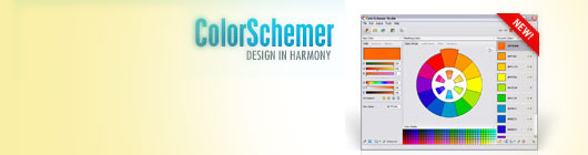
For those of you who are feeling the difficulty in finding and identify color harmonies, ColorSchemer Studio is the perfect solution to determine the color of an attractive and professional. We as designers are
never out of color, because the colors we can make the work more lively and beautiful. So, for those who are difficult to manage and visualize color combinations, then they should familiarize themselves with color theory to study some sensitivity training, this graphic science has been formulated in conformity with the needs of these people.

Sometimes we can not determine the right color combination for a design, either because of lack of inspiration or understanding in processing the colors to be in accordance with the concept / brief, or might also because color blindness. There are several easy and professional solution to overcome this problem, you can read it at:

Color-related articles:

  1. Color Trends 2012 | Popular colors in 2012
  2. Tools for Choosing Color Combinations for Your Designs
  3. Color Psychology in Branding & Marketing
  4. 5 Important Points to Know About Color Theory
  5. Balance in Graphic Design

Maybe some of you have read this 5 color-related articles but still confused how to choose colors harmony, for that I will share with you a graphic design software that can be used as a tool in determining and selecting the best colors for your design portfolio.

This graphic design software named ColorSchemer, which has been tested by world class designers and is considered effective to choose a color harmony. I also have tried and the results are satisfactory. Through several steps you can already get an instant color harmonies combinations.

Identify Color Harmonies with ColorSchemer Studio


ColorSchemer Studio

ColorSchemer Studio is a professional color matching application that will help you build beautiful color schemes quickly and easily. Use ColorSchemer Studio to identify color harmonies for the web (RGB) or print (CMYK), create palettes from imported images, search and find thousands of color schemes that may be used.

ColorSchemer Studio 2 is a professional color matching application for anyone from hobbyists to advanced professionals. Work with a dynamic visual color wheel, instantly explore harmony relationships and even let ColorSchemer Studio intelligently suggest color schemes for you!

ColorSchemer Studio

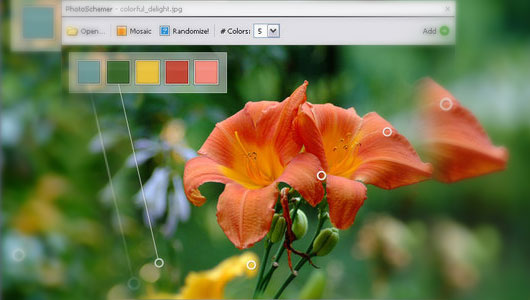
"Use the PhotoSchemer tool to build unique color schemes based on any picture, image or photograph. Just drop an image onto the program and let the PhotoSchemer do the rest!"

ColorSchemer Studio

Mix colors and create gradient blends: Use the built-in Color Mixer to create a single mixed color or a gradient path between two colors. or use the Variations palette to find colors that are similar or related to any starting base color. Use the Export Wizard to export your color schemes to a number of popular applications and formats:

HTML color chart
CSS style sheet
GIF image
NEW PNG image
NEW Adobe Swatch Exchange (.ase)
Photoshop Color Palette (.aco)
Illustrator Color Palette (.ai)
Macromedia FreeHand/Adobe FrameMaker
Corel Painter Color Set
Color Table file (.act)
NEW XML file (.xml)


Visit ColorSchemer StudioDownload ColorSchemer Studio

Color Trends 2012 | Popular colors in 2012

Color Trends 2012 | Popular colors in 2012
Color Trends 2012 - Popular colors in 2012. This color list is useful for some companies engaged in the fashion, clothing, paint, and other business which uses color as an important part in their daily life. Color has a special role in the industry. Because of the importance of the position so they can not arbitrarily use any colors in their products. To be sure, color trends 2012 will affect many business centers and lifestyle.

Color Trends 2012 | Popular colors in 2012

Not all companies are issuing color trends, there are only a few companies that are competent and most influential when releasing their products, especially in matters of color. And its use spread to the street corners and even into parts of the village.


Initially I didn't realize the importance of color trends. But now my eyes are open and realize that the color trends are part of our daily life and it needs extra attention.

Dulux Colour Trends 2012

source: Dulux Colour Trends for 2012-13

Carnivale
Color Trends 2012

Let's have some fun with bold colour!
Colour can intensify our lives and add drama and excitement to any room. It's time to be adventurous! A heightened focus on colour can create an impression of opulence and luxury. Balance these bolder hues with white, beige or natural stone.

Color Trends 2012

Immerse
Color Trends 2012

Blues are dominant in fashion and are now evolving into the home.
Play with these tonal colours to achieve your perfect domain and create some ocean-inspired colour schemes. Mix darker and lighter blues with translucent and textured accessories to transform your room into a fresh and energising space.

Color Trends 2012

Nurture
Color Trends 2012

We embrace the combination of yellow and green as we observe them in nature. Therefore, we see these citrus colours easily translating into fashion and interiors. Introducing green or yellow-greens into your home can create a feeling of calmness and tranquillity.

Color Trends 2012

RAW
Color Trends 2012

Natural beauty is a style we're starting to celebrate much more. 'Raw' symbolises colours inspired by untreated woods and rusted earthy tones. Create neutral schemes using stone or taupe, soft greys, organic rust and brushed hues.

Color Trends 2012

Reset
Color Trends 2012

'Re-set' realigns our current outlook and desires on less, not more.
Simplicity is the new backdrop using classic whites, beiges, silver greys and charcoals. For the quintessential elegant scheme these whites will accentuate natural light and provide a sense of space.

Color Trends 2012

Time-Honoured
Color Trends 2012

Antique and vintage goods have enjoyed a revival in the past year signifying our return to things which endure. These warm hues can create a feeling of nostalgia and are reminiscent of times past.

Color Trends 2012

The complete guide to interpreting logos & It's Basic Elements

The complete guide to interpreting logos & It's Basic Elements
As part in planning any corporate identity design, logo likened to a body part capable of expressing the hearts of a product or company.

In terms of marketing, a logo has a function as an identity that differentiates a product with others. They are not separated from the essence of the logo itself, as an art form of the usual two-or three-dimensional objects. As a work of art, a logo can not be separated from the basic art elements that form it, such as line, shape, color, space, typography, etc.. As noted by John Murphy:

The successful designer of trademarks and logos needs to have basic intellectual and draftsmanship skills in addition to a sensitivity to the aesthetic elements of design.

The Four Basic Elements Of A Logo


I will present four basic elements that make up the logo
    1. Line
    2. Shape
    3. Color
    4. Typography

four basic elements of a logo

Following is an explanation of the four basic elements of a logo


1.Line


four basic elements of a logo

A line by Lexicon Graphic is: a thin two-dimensional object that extends. While Lillian Gareth defines the line as a set point, which is when it all aligned, the length dimension would appear prominent and the figure is called the line.

Establishment of a line is a movement of a point, forming a lasting trace of a scratch. They can occur through pencil, pen, brush and others. In art, the line has a fundamental function, so it is likened to the heart of art. Lines are often referred to as contour.

The importance of line as an element of art has been seen since ancient times. Our ancestors in ancient times have used the line as a medium of art expression in the walls of the caves. They've also used the lines to form their ritual objects. An example is a painting on the walls of Lascaux cave in France, Leang-leang in Sulawesi, Altamira in Spain and many more. The human ancestors also use the line as a medium of communication, such as the Phoenician letters nail relic (Century 12-10 BC) in the form of scratches. Besides the potential contour line as a shaper, it is also an element to express the motion and shape. Both the form of two or three dimensions.

four basic elements of a logo
Lascaux Cave Paintings


Atmosphere in a line


In conjunction as an art element, the line has the ability to express atmosphere. The atmosphere can occur due to the stimulation of the simplest forms around us that are represented from the line shape itself. An example is when we see the lines that form the letter 'S', or so-called 'line of beauty' we would feel something soft, smooth and supple. This feeling happens because our memories to associate it with the dominant forms curved, like a dancer or a motion of the waves.

Here are some types of lines and the atmosphere it evokes:

  • Straight lines are impressive strength, direction and resistance.
  • Curved line of impressive elegance, movement, growth.

and here I present some kind of line and associations it evokes:


  • Horizontal: Giving suggestions about serenity or something immovable.
  • Vertical: Stability, power or grandeur.
  • Diagonal: Not stable, something that moves or dynamics.
  • Curved 'S': Grace, elegance.
  • Zig-zag: Passionate, spirit, dynamics or fast motion.
  • Bending up right: Sad, depressed or grief.
  • Diminishing Perspective: The distance, distance, longing, and so forth.
  • Concentric Arcs: Expansion, the movement expands, joy, etc..
  • Pyramide: Stable, majestic, strong or massive force.
  • Conflicting Diagonal: War, conflict, hatred and confusion.
  • Spiral: The birth or generative forces.
  • Rhytmic horizontals: Lazy, calm pleasant.
  • Upward swirls: The spirit of fire, burning, desire to grow.
  • Upward Spray: Growth, spontaneity, idealism.
  • Inverted Perspective: breadth of the infinite, absolute freedom, widening unimpaired.
  • Water Fall: Waterfalls, a rhythmic reduction.
  • Rounded Archs: Curved round sturdy and strong impression.
  • Rhytmic Curves: Weak graceful, cheerfulness.
  • Gothic Archs: Trust and religious.
  • Radiation Lines: Convergence, explosion or eruption.

Furthermore, the line according to the typical functions which are able to form a symbol that has special meaning strongly support its use as a symbol element. The use of line as the element symbol was first introduced by Otto Neurath (1882 - 1945) (a teacher and social scientists), who named symbol as Isotype. Then Isotype language has evolved and become one of the language of images that can represent various forms of communication. In subsequent developments, other forms of this symbol widely used in the design of the logo in it's effort to be easy to remember and have good communication power.

2.Shape


four basic elements of a logo

Understanding the shape according to Lexicon Graphic is kind of a way or form of something, like a circular ellipse, round rectangle, and so forth. From these definitions can be described that the shape is a form of visual things, usually in the form of rectangular, triangular, circular, etc. elip. In the process of designing a logo, the shape occupies a position that is no less important than other elements, as regular geometric shapes is a symbol that carries a certain emotional value. It is commonly understood, because the form has the effect or impression visible. As expressed by Plato, that the manner or form is a world language that is not hampered by such differences found in the language of words. But Plato's theory should not apply. There are other aspects that lead to language forms are not always effective. As the international application forms with the traditional target or vice versa. In other words, if the target is not familiar with the traditional plain language, use the language of international invisible and vice versa.

For example: for example if we have to design the logo of the fleet of the armed forces of the republic of Tanzania, will be less prevalent if we choose the form of keris (the traditional dagger of Indonesia) as a supporting element in the logo, because the shape of the keris less or even not recognized by the people of Tanzania.

The complete guide to interpreting logos

From that example, then comes the theory of frames of reference (a frame of reference) and the field of reference (field experience) explains that some form of message acceptance is influenced by several aspects of the five senses, thoughts and memories. So as in the example above problems, the shape of the logo will be more effective and communicative when aimed at the armed forces of the Republic of Indonesia, and not with the Dominican Republic because they have no frame of reference and field of reference about the keris in their memory.

Here are some examples of forms and associations thereof based on the book Handbook of Design & Devices writing Clarence P. Hornung.


  1. Triangle, a symbol of the Trinity concept. A religious concept which is based on three elements of the universe, namely God, man and nature. In addition, the triangle is a manifestation of the concept of the family ie father, mother and child. In the world of metaphysics triangle is a symbol of the body, mind and soul. While in the Egyptian culture, was used as a symbol of femininity and in letters Hieroglyps triangles depict the moon.
  2. Yin Yang, is a form included in this type of Monad, which is a form that consists of round geometric figure which is divided by two forms intersect with each facing the center point. In China, the form is called 'Yin Yang', in Japan called 'Futatsu Tomoe' while the Koreans call it 'Tah Gook'.

The complete guide to interpreting logos

'Yin Yang' is a picture of two natural principles:


  • 'Yang' represents the brightness, 'Yin' symbolizes the darkness.
  • 'Yang' symbolizes nirvana, 'Yin' symbolizes the world.
  • 'Yang' as the sun, 'Yin' as the moon.
  • 'Yang' has an active position, masculine, 'Yin' passive, feminine.

All of them represent the basic principles of life, namely the balance.

3.Color


four basic elements of a logo

The understanding of color is divided into two parts by its nature

  1. Colors according to the science of Physics.
  2. Color by Material science.:

Colors according to the science of Physics.


The definition of color according to the science of Physics is: the nature of light depends on the wavelength of the reflected object. Object that reflects all wavelengths appears white, and other objects that do not reflect at all will appear black. Dispersion can occur when sunlight comes through a glass prism-shaped spectrum and speed of spreading depends on the wavelength itself. Primary colors of light or the spectrum is blue, yellow and red, with combinations that can form any color.

Color by Material science


Definition of color according to materials science is: any of certain substances that give color. Pigments provide color to plants, animals, as well as in paints, plastics and other manufactured goods except on textiles that use dye for coloring substance. A typical colored pigments can therefore suck some wavelengths of light, and reflects the other. Pigments are widely used in industry, such as plastic, rubber, ink, and lenolum.

As part of the elements of the logo, color serves as a means to reinforce and strengthen the impression, or purpose of the logo. In planning a corporate identity, color has a function to strengthen the aspect of identity. More is said by Henry Dreyfuss, the colors used in graphic symbols to reinforce the intent of the symbols themselves. An example is the use of red color on the security triangle, also the colors used for the traffic light. The color red for stop and green for go. From these examples can be seen that the influence of color can provide a fast and powerful impression.

The ability of color in creating the impression can cause certain effects. As described by J. Linschoten about the psychological effects that may result:

The colors are not something that can only be observed only, a color may affect behavior, and plays an important role in aesthetic judgments. It also helps determine on whether or not we would prefer one or many objects.

From this understanding can be explained that: In addition to can only be seen with the eyes, the color also can affect a person's behavior, aesthetic judgments, and also helped determine on whether or not a human love at some things.

Here are the potentials of color and character that could give an impression on someone:

  • a. Black, as the oldest color (dark) by itself became a symbol for the nature of the pitch and darkness (also in terms of emotions).
  • b. White, as the brightest color, symbolizing light, difficulty etc..
  • c. Gray, is the most neutral color in the absence of a specific nature or life.
  • d. Red, is conquered, expansive (widespread), dominant (ruling), active and vital (life).
  • e. Yellow, with rays that are less deep, is representative of the things or objects that are light, the momentum and impressive things.
  • f. Blue, a color that can lead to the impression of depth (dediepte), the nature of the infinite and transcendent, it has also the nature of the challenge.
  • g. Green, has the nature of balance and harmony, evoking serenity and a place to collect new powers.

Of the many colors can be categorized into several sections, often referred to by the Prang color system invented by Louis Prang in 1876 that includes:


  1. Hue, is a term used to indicate the name of a color, like red, blue, green and so on.
  2. Value, is the second dimension of the brightness or color. As the level of color from white to black.
  3. Intensity, often called chroma, is the dimension associated with bright or gloomy colors.

In addition, there are still some other color systems, such as:


  • CMYK or Process Color System,
  • Munsell Color System
  • Ostwald Color System
  • Schopenhauer / Goethe Weighted Color System
  • Substractive Color System, as well as
  • Additive Color / RGB Color System.

Among the various color systems above, which are now widely used in visual media industry print is CMYK (Process Color System) which basically divides color into Cyan, Magenta, Yellow and Black. While RGB Color System is used in electronic visual media industry.

4. Typography


four basic elements of a logo

Typography definition according to the book "Manuale Typographicum 'is:
Typography cans defined a art of selected right type printing in accordance with specific purpose; of so arranging the letters, distributing the space and controlling the type as to aid the reader's maximum.

From the definition, it can be concluded that the typography is the art of selecting and arranging the letters by setting its spread in the available spaces, to create a special impression, so that will help readers to get comfortable reading as much as possible.

As part of human culture, the letter was never separated from daily life. Almost every nation in the world using it as a means of communication. Historical development starting from the use of typography pictograph. The form of this language among others used by the Vikings of Norway and Sioux Indians.

Egypt had developed a kind of 'letter Hieratia' or better known by the name 'Hieroglyphe' at around 1300 century BC. The form of this typography is the root of the form Demotia, which were written using a special pen. The form is finally growing up in Crete, then spread to Greece and eventually spread throughout Europe. The peak development of typography, occurred at about the 8th century BC in Rome as the Romans began to establish their power. Because the Romans did not have its own writing system, they learn the Etruscan writing system which is a native of Italy, and improve it so that formed Roman letters.

Typography current developments have evolved from the phase of creation by hand (hand drawn) to have computerized. Computerization makes use of typography becomes easier and faster in time with the kind of choice of hundreds of letters.

Here are some fonts based on the classifications made by James Craig, as follows:

1. Roman letters
The characteristics of this letter is to have the fins / foot / taper-shaped serifs, at the edges. Roman letters have the thickness and thinness of the contrast on the lines of the letter. The impression created is a classic, elegant, graceful and feminine.

2. Egyptian
Is a typeface that has a characteristic foot / fin / serif square shaped like a board with an equal or nearly equal thickness. The impression created is sturdy, strong, sturdy and stable.

3. Sans Serif
San Serif is without fins / serif, then this type do not have fins on the end of the letter and has an equal or nearly equal thickness. The impression created of this type is a modern, contemporary and efficient.

4. Script
These fonts resemble hand scratches done with pen, brush, or sharp pencil and usually skewed to the right. The impression created of this type is personal and intimate nature.

5. Miscellaneous
This typeface is a development of the forms that already exist. Plus decorations and ornaments, or decorative lines. This typeface has the decorative and ornamental impression

Several aspects must be considered in the selection of typefaces are products that will be highlighted and also the character of its market segment. Like for example the women perfume products wouldn't use the Egyptian typeface because of it has strong and hard impression Instead of using the Roman typeface that classical and soft shades that match the character of fragrant oils, and female..

Tools for Choosing Color Combinations for Your Designs

Tools for Choosing Color Combinations for Your Designs
Many novice designers giddy and confused in determining color. Understandably, a graphic designer will not be considered an expert if not mastered the field of color. Errors in color selection can be fatal, some colors will make the eyes become tired
quickly if not combined with an appropriate color. Though everyone has their own taste in the choice of color combination, but there is a meeting point. Yes! harmony.

For those who struggle to determine the choice of color combinations in website creation, perhaps the sites below can provide inspiration in choosing colors.

1. Color Scheme Designer


Tools for Choosing Color Combinations for Your Designs

In essence, this tool makes it easy to create color combinations that fit with only sliding your mouse. The combination of colors that are produced quite good, but of course it should be sorted out according to your needs

2. Color Schemer


Tools for Choosing Color Combinations for Your Designs

On this site you can not create an interactive color combinations, but it provides some interesting color combinations that have been made by its members. Here we can find the desired color combinations such as "green", "dark", etc.

3. Adobe Kuler


Tools for Choosing Color Combinations for Your Designs

This site is quite popular among the others because it is dominated by graphic designers from photoshop community which can be accessed directly using some adobe software. In addition, the availability of a very diverse choice of templates to make this site very popular. This site is also user friendly, and the availability secular community of users is comparable with the rather slow access to website flash-based apps.

4. Aviary


Tools for Choosing Color Combinations for Your Designs

This website is operated by sifting through several categories to access pages quickly and easily. It looks quite bright and it makes it pleasing to the eye and of course will be easy to operate for the benefit of our design work.

5. Pictaculous


Tools for Choosing Color Combinations for Your Designs

The hardest thing in designing a web is the selection of colors. But now many aids in color selection. We no longer bother to choose a color theme for a particular image using pictaculous. First prepare an image as a Pantone color sample. Using pictacuulous quite handy in which there is a reference color and directly connected with the advice of Kuler and colourlovers. Glance can be summarized as follows.

Tools for Choosing Color Combinations for Your Designs

-First open the site from your browser.
-browse the sample picture that you have prepared.
-Click on "get my pallete" button.
-Once the process is completed scroll to the bottom, itu should bring up your template and some color advice from Kuler and Color lovers.

6. Color Hunter


Tools for Choosing Color Combinations for Your Designs

It can make color palettes from images.

7. Color Combinations | Color Schemes | Color Palettes


Tools for Choosing Color Combinations for Your Designs

That will include the color of his labs by writing as a combo or Combos. It's worth a shot! It suggests the bright colors that we usually find on the website.

8. ColorJack: Sphere (Color Theory Visualizer)


Tools for Choosing Color Combinations for Your Designs

Color jack emerged as a site of color, it works with to favor the use of the color circle and the results can be directly exported via design software such as adobe illustrator, photoshop, and so forth.

9. Veerle’s Topp, Daily Color Scheme


Tools for Choosing Color Combinations for Your Designs

Color scheme is great demand by graphic designers are also utilized by this website. Access to this site could become an option to look for color. You can download the scheme with the extension of design software such as AI and other.

10. Colour Lovers


Tools for Choosing Color Combinations for Your Designs

Assistance from the community by sharing the obtainment of color make this site excel in their field. Look at secular adobe is very similar to this site with just a different flash.

11. Pantone


Tools for Choosing Color Combinations for Your Designs

As the name implies, this website is special in Pantone, it uses an accurate geo system. I say accurate because there are some experts who made up the color in the color catalog is the art plus the science of calculation, especially this site provides a choice: ORIGINAL Pantone matching system. Well you could try this site if you want to view Pantone matching (not tacky).
 
Support : Creating Website | Johny Template | Mas Template
Copyright © 2011. Tutorials Blogger - All Rights Reserved
Template Created by Creating Website Published by Mas Template
Proudly powered by Blogger