
Similar to other areas of design, product packaging uses many methods to achieve their goals including interesting shapes, vivid colors, strong typography, reusable packaging and unique textures to help draw initial attention.
Once in front of the supermarket shelf, consumers will decide within three seconds whether the bar of chocolate from company X, the box of chocolates from manufacturer Y or the bag of sweets from factory Z finds its way into their shopping trolley.The fundamental protection and barrier properties afforded by modern packaging are simply accepted as a matter of course.
There is a general trend for all confectionery packaging materials to become increasingly sophisticated. Children’s products based on popular cartoon characters or toys are growing in popularity; here too, there are two distinct trends: firstly, towards miniature products, and secondly, towards mono-products. And all these products need packaging, be it transparent packaging or a white/opaque foil with a hologram to cut out and play with.
I have built a strong craving for chocolate and my love for them relocated me to accumulate 50 Colorful Confectionery Packaging Designs. Lets take a look at 50 Colorful Confectionery Packaging Designs for your design inspiration.
Packaging Design related articles:
- 60 Best Food Packaging Designs for Inspiration
- 40 Modern Electronic Packaging Designs Inspiration
- 40 Awesome Coffee Packaging Designs Inspiration
- 35 Cute Milk Packaging Design Inspiration
- 18 Creative Tobacco Packaging Designs
50 Colorful Confectionery Packaging Designs for Inspiration
1. Maison Dandoy Confectionery Packaging Designs designed by Base Design

“With values rooted in the past but a business plan oriented toward the future, Dandoy asked Base Design in 2011 to modernize and rethink its visual identity, packaging range and website. The main questions to solve were “How do you transform a small-scale, local family business into a global family brand, without losing the image of local craftsmanship and true tradition?” and “How to reach a broader audience?”.
To tackle these questions, Base Design started with interviews in the field to gauge the context. This was followed by an analysis of Dandoy’s assets, opportunities and brand experience, a benchmark study, ideas for improvement and a workshop with the client. All this resulted in about ten design-strategy recommendations followed by a graphic design phase.”
2. La Nevateria Confectionery Packaging Designs designed by Bisgràfic

“La Nevateria is a “sweets and coffe” shop which carries out both activities at 50%. Packaging is divided equally between brown (symbolizing the coffee) and different basic colors (symbolizing sweets).”
3. Marou x Wallpaper* Confectionery Packaging Designs designed by Rice Creative

“When Wallpaper* Magazine discovered Marou Chocolate, our client, they felt that this singular dark chocolate, hand-crafted in Saigon using purely local ingredients was a perfect match for their third annual Handmade issue (an issue with a focus on unique products combining luxury, craft and inspiration). Marou offered to create a special edition Wallpaper* chocolate bar in time for exhibiting at the 2012 Salone de Mobile in Milan. The packaging we designed for this occasion would stay true to the inspiration behind the standard Marou chocolate bars and press further the attention given to lovingly hand printed details. We strayed some from the traditional motifs of the standard bars to embrace a more modernist approach while incorporating the well known Wallpaper* asterisk mark. It began by creating a new background pattern, which moved away from the traditional lattice and organic elements, replacing them by geometric elements forming an extension of the Wallpaper* asterisk.
The same hand mixed inks and screen-printing methods used on the standard Marou packs were employed, but a new palette of hues would be used, derived from the Wallpaper* handmade seal. The seal even informed a limited edition version of Marou’s Monogram for this occasion. The final touch of hand embossing some of the pack’s design elements set the stage for a fully considered hand crafted piece.”
4. IKEA Confectionery Packaging Designs designed by Stockholm Design Lab

“IKEA is a worldwide Swedish home furnishing company with 28 distribution centres and a global network of 267 stores attracting a total of 590 million visitors.
Stockholm Design Lab created a design and packaging concept when the company combined its various food and catering units under the IKEA brand. The aim of the Swedish Food Market is to enhance the Swedish identity of IKEA.”
5. Student work Confectionery Packaging Designs designed by Jonathan Faust

“Regina is a Portuguese chocolate brand founded in 1928. Their products are delicious but their identity really needs some love.
I have focused on the logo and packaging.The logo is combined with the flavour. As you see every flavour has it’s own unique logo. Combined with the colours you get a new product which stands out. Logo and flavour-text is hand drawn. The rounded corners and swashes is a reference to their history and what it’s all about – chocolate.”
6. Student work Confectionery Packaging Designs designed by Olivia Paden

“Brief: Repackage items for the existing online retailer, Dulce Mexico, that provides traditional Mexican candies, fruit snacks, and drinks from a variety of sub-brands. Rethink how Dulce Mexico can introduce themselves to a US market with a stronger brand presence.
Concept: As Dulce Mexico, currently an online candy retailer, is in a unique spot right now as they’re basically introducing themself to a US market, they have a unique opportunity and range of what they can do and how far they can push the brand. My solution to Dulce Mexico’s branding strategy is to play up the elements that are already unique to their candies, the oral experience and sinful indulgence of the sweet and spicy.
And so, the fun is in the foreplay, as Dulce Mexico’s packaging highlights the opening ceremony and sequence of indulging in Mexican candy. Adding intuitive elements such as tequila and tamarind mix further embraces the very experimental nature of these traditional desserts. Whether its girls’ night out, or girls’ night in, Dulce Mexico’s redesigned packaging catches the US market’s attention with a more playful, sexy, and contemporary eating experience.”
7. Hatziyiannakis Confectionery Packaging Designs designed by mousegraphics
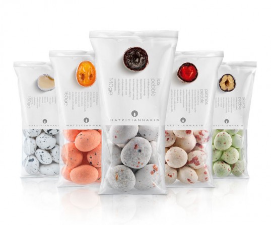
“Brief: our product is strange and unique. We want to make this clear.
Audience: bold and brave consumers, with a sweet tooth and a flair for discoveries. intellectuals of the gourmet type.
Design: to paraphrase the famous Marshall McLuhan expression, “the medium is the content” in this packaging extravaganza. Τhe symbiotic relationship of medium and message, (of which the media guru preached), is here translated into the eccentric coupling of package-product. Αn ‘outer-inner’ game of illusions is played here, for the eyes of the consumer. Τhe paradox of a sweet, eddible, even appetizing pebble, the beauty of an open crop, with its shockingly realistic flesh, fake cherries which can fool birds into coming to nibble at them like in the ancient paintings of Zeuxis, rocky-tasty formations: all these are mind treats we prepared for the consumer within a heightened – reality design environment.”
8. Walker’s Chocolate Confectionery Packaging Designs designed by Bridgemark
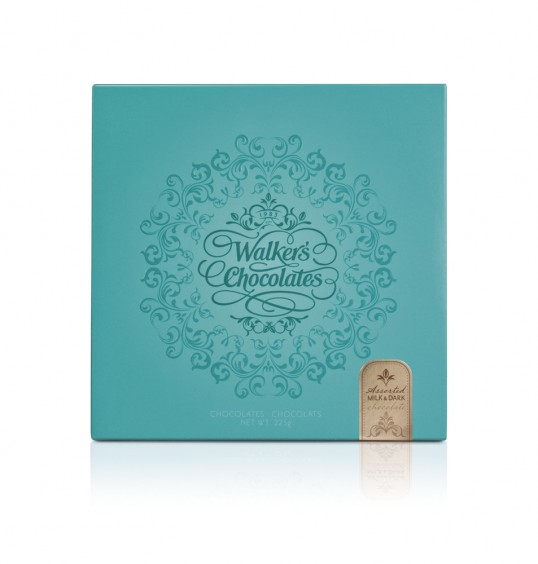
“The Walker’s family has been creating confectionery in their Candy Kitchen in small batches, hand-stirred in copper kettles in the traditional way for almost 30 years.
Walker’s Chocolate needed to carefully transform their brand to draw in younger consumers while continuing to appeal to their loyal and valued aging customer base. Bridgemark’s boutique package stands alone as an exquisite, gift-able offering bypassing the need for additional wrapping which is costly and labor intensive.
What was once a utilitarian box is now a treasured gift. Walker’s new versatile packaging is steeped in tradition with an inspired color palette that is bold and contemporary.”
9. Lyons Confectionery Packaging Designs designed by jkr

“This month sees the launch of newly designed packaging for Lyons cakes. Briefed to explore and celebrate the brand’s rich heritage, the new look plays back to its famous history of teashops and its waitresses from the 1890s.
With a long-‐standing tradition for ‘proper’ cakes, the brand was renowned for its nippy waitresses serving up affordable tea and cake to the masses. Having lost its way over the years, the redesign focused on communicating the brand’s story in a relevant and contemporary manner.”
10. Dallmayr Confectionery Packaging Designs designed by Factor Product München
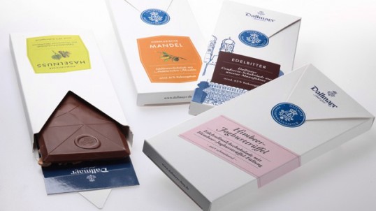
“The Munich delicatessen Dallmayr produces a range of high quality confectionery products in its own chocolate factory. The new Dallmayr chocolate range with refined recipes and only the best ingredients is the result of consistent further development and the company philosophy to strive for outstanding quality.
The objective for the designers from fpm was to express these high quality standards and manufacturing philosophy through suitable packaging design. At the same time the structure of the product range and different categories of chocolate quality should be easy for customers to understand.”
11. Selfridges Selections Confectionery Packaging Designs

12. Cuberdons Léopold Confectionery Packaging Designs designed by Jérôme Stéfanski

“Cuberdons are traditional Belgian sweet born in the 19th century. Cuberdons Léopold is a yound and modern brand of cuberdons that wants to modernize the product but also keep the vintage image by using graphical elements such as purple stripes that remains the beach huts of the Belgian seaside. The drawing face is reproduction of the face of King Léopold 1st, first king of Belgium, who has marked the independance of the Kingdom of Belgium in 1831, a period when cuberdon has been invented. The box contains 21 cuberdons, a reference to 21st July (Belgian National Day).”
13. Marou Confectionery Packaging Designs designed by Rice Creative

“Chocolate makers working directly at the source of the cacao farms are still very few and far between. Marou Faiseurs de Chocolat, based in Ho Chi Minh City (Saigon) is one such company who have created the first single origin gourmet bean-to-bar chocolate to come out of Vietnam.
Marou was founded less than a year ago by two adventurous Frenchmen. They decided, to use the small amounts of cacao beans harvested, fermented and dried on small family farms throughout the Mekong Delta and southern highlands of Vietnam, to make an extraordinary chocolate.
Marou approached Rice Creative at the beginning of their adventure, with the mission to build the brand’s visual identity and packaging.”
14. Chocolates with Attitude Confectionery Packaging Designs designed by Bessermachen for Brandhouse

“12 archetypes.12 filled chocolates.12 months. Bessermachen design studio had a dream about how archetypes could be shown as young women, calendar girls in a classic 50s style, to create the perfect packaging for archetypes and chocolates. But we knew that for it to be authentic, it would have to be done right.
They were perfectionists in the 50s. First they photographed the model. Then they painted over the picture to achieve the right effect. There were no shortcuts. And speed was of the essence.
To create pin-up girl illustrations, you have to be faithful to the way it was done in the 50s. From the ground up and without compromise.
Packaging for the chocolates is a chapter for itself. Everything from weight to quality and coating needs to be taken into consideration. Suggestions range from using fabrics to cardboard. But in the spirit of the 50s we end up choosing tin boxes. The production, however, is modern and made in China.”
15. Brownerie Confectionery Packaging Designs designed by Index43

“This project consisted of designing an identity and packaging for a bakery specializing in gourmet brownies. The business model is oriented towards selling brownies mainly as a gift and/or for special ocasions. With this in mind we focused on creating a simple elegant package that would work as a frame to showcase the rich texture and different toppings of the brownies.”
16. Swoon Cookie Crafters Confectionery Packaging Designs designed by Meers

“Originally called PS-Sweets, this custom sugar-cookie maker was ready for a complete rebrand to spur new business nationwide and position the company for the future. We created a new name, color palette and more elevated look and feel (via letterpress printing primarily) for the packaging and identity that embodied the premium fun of the product. To keep costs containable for this small company, we elected for a ready-made box and put effort into a custom band to enclose it.”
17. BETA 5 Holiday Collection Confectionery Packaging Designs designed by Glasfurd & Walker

“BETA 5 chocolates are produced in small batches using ethically sourced estate chocolates and premium ingredients.
The name comes from the form-5 beta crystal structure which is the most stable form of cocoa butter crystallization, formed through the controlled melting, and subsequent cooling (tempering) of liquid chocolate.
As an addition to their core range this range of packaging was developed for their holiday products.”
18. Amarelli Confectionery Packaging Designs designed by Angelini Design

“New Amarelli packs by Angelini Design. This new packaging is the latest “pearl” that Angelini Design has created for centenary Calabrian confectionery company Amarelli. The small boxes are made in metal and mimic the colors of anise and mint. The typically retro style, material and finish are the result of a mix of quality, refinement and attention towards tradition, values that Amarelli has always carried forward with coherence, allowing it to maintain a solid position as one of the longest standing Italian brands.”
19. Elio Di Luca Confectionery Packaging Designs designed by Puigdemont Roca
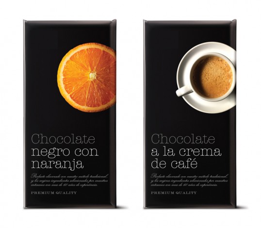
“In a hyper-competitive market, standing out from the competition is crucial. To this end, we decided to show the basic ingredient of each flavour of premium chocolate with a fresh perspective, shooting the images from a zenith angle. In this way, we managed to convey the concept of ‘top end’, and in turn raise a range of emotions in the consumer.”
20. Point G Confectionery Packaging Designs designed by Chez Valois

“Point G a French word, meaning the G spot… but make no mistake, don’t get any ideas, we are talking here about a gourmet spot, the rallying spot of all foodies! Because gastronomy mixes both pleasure and sensuality, it can be shared, offered, discussed… in flavours, colours, images and words. Ode to gastronomical delights in all their forms. With the new packaging platform, you lick (léchez), drink (buvez), crunch (croquez), experiment (expérimentez)… gulp (gobez), spread (tartinez), roll (tirez), pearl (perlez), sear (saisissez), share (partagez), and so on…
21. The Grown Up Chocolate Company Confectionery Packaging Designs designed by Toast Design

The Grown Up Chocolate Company had created a range of luxury hand-made chocolate bars inspired by childhood favourites. This company and its wonderful bars offered a unique way of satisfying the most discriminating chocoholic, but needed to be branded and designed to ensure the customers experience started before they even tasted the goods – so they turned to Toast Design.
22. JZM MC2U Confectionery Packaging Designs designed by Gidea Group

“As the leader of Taiwan’s traditional cake industry, JZM has be worldwide known for its pineapple cakes packaged in this little golden box for a long time.
On this seasonal packaging design, we implemented the classical golden pineapple cake package with the joyful Christmas design, also bringing out a sense of East meeting West.
This special Christmas packaging was a commercial success for JZM, especially loved by Japanese and Hong Kong tourists who came to Taiwan to spend their Christmas Holidays, a chic and lovely souvenir to take home with!”
23. Real Chocolate Confectionery Packaging Designs designed by Studio Alto
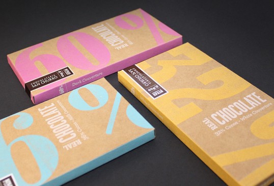
“San Churro’s Real Chocolate is a product range developed in reaction to a chocolate market flooded with inferior ‘confectionary’ chocolate.
In the words of San Churro – “When it comes to chocolate, the truth is that there’s no substitute for REAL cocoa butter. It’s like ketchup without tomatoes, or an omelette without eggs – it’s the key, essential ingredient. Chocolate without it simply is not chocolate, but rather a sub-standard B-grade pretender: all show, no substance.”
24. BETA 5 Confectionery Packaging Designs designed by Glasfurd & Walker

“BETA 5 chocolates are produced in small batches using ethically sourced estate chocolates and premium ingredients.
The name comes from the form-5 beta crystal structure which is the most stable form of cocoa butter crystallization, formed through the controlled melting, and subsequent cooling (tempering) of liquid chocolate.
As a result, the identity reflects this approach to the chocolate making process – a careful blend of science and craftsmanship.
The packaging design was a carefully considered and executed aspect of the brand development. Understated and refined, the packaging doesn’t distract from beauty and vibrancy of the products inside them which are an exciting discovery.”
25. Student work Confectionery Packaging Designs designed by Amy Nortman

“Bonafide is a concept brand and product line that I named and created from scratch. The idea was to design a modern take on the tradition of Southern hospitality, creating a genuine Southern eating experience through beautifully handcrafted baked goods that anyone can access and enjoy, but taste as if ones own grandmother has baked them herself. The look and feel are designed to reflect this sentiment, and the illustrations to create a simple and friendly-fun, yet effective way to communicate.”
26. Burnt Sugar Confectionery Packaging Designs designed by D. Studio

“Bonafide is a concept brand and product line that I named and created from scratch. The idea was to design a modern take on the tradition of Southern hospitality, creating a genuine Southern eating experience through beautifully handcrafted baked goods that anyone can access and enjoy, but taste as if ones own grandmother has baked them herself. The look and feel are designed to reflect this sentiment, and the illustrations to create a simple and friendly-fun, yet effective way to communicate.”
27. Uten Confectionery Packaging Designs designed by Marcin Rusak Studio

“Uten is a Norwegian product line containing natural and seasonal jams, chocolates and condiments that are home made and free from gluten, milk, soy, refined sugar and preservatives. The packaging encourages the buyer to re-use, with recipes and tips inside the label folder. When the jar is empty and the chocolate is eaten, simply take of the tags (the string makes sure you’ll have no sticky glue marks!) and use the empty containers to create your own delicious foods.”
28. Student work Confectionery Packaging Designs designed by Kyla Tom

“yum. is a playful and fictional chocolate bar brand I created for a class in college. We had to create a brand identity and theme as well as the packaging. The idea behind yum. is to embrace the simplicity of chocolate. Chocolate is a joyful experience that can be felt as soon as it hits the tongue. Ultimately, this experience can be summed up in one word: yum. Color pops were brought in to a stark white background to hint at the burst of flavor and the fulfilling experience as soon as the chocolate is eaten. When the packaging is opened, the chocolate bars smile, bringing in a fun and playful nature to the brand. Simple, delicious chocolate. That is yum.”
29. Student work Confectionery Packaging Designs designed by Cory Etzkorn

“What’s fit for the oval office, flyer than Airforce One, and Stronger than the U.S. dollar? The Original PepperMint, of course! These federal-reserve-fresh mints come in two delicious and highly stylized varieties sure to please your inner capitalist.
30. Thomas Haas Chocolate Sparkle Cookies Confectionery Packaging Designs designed by Cameron Snelgar

“What started as a label replacement project, gained momentum and we soon found ourselves responsible for delivering two packages for the “The World’s Best Cookie” (Vancouver Sun, Feb 2003).
Initially, Thomas Haas’ freshly baked Chocolate Sparkle Cookies were presented in a cellophane wrapping with a sticky label attached. The refrigerated home bake cookies were in stock paper with a sticky label attached.
I knew that the Chocolate Sparkle Cookies as with most of Thomas’ creations were innovative and unique. The challenge was to communicate the “Sparkle” within, while simultaneously preserving the carefully crafted Thomas Haas brand.
The package for the home bake set of six Chocolate Sparkle Cookies came first. Wrapped in Thomas’ signature ribbon branding and logo, it includes angled sides. Earlier in the design process all of the sides were angled, naturally conforming to the spacer tray within. However, the option for additional front display and stacking was needed, hence the flat top and bottom.
31. Melt Confectionery Packaging Designs designed by JJAAKK Design
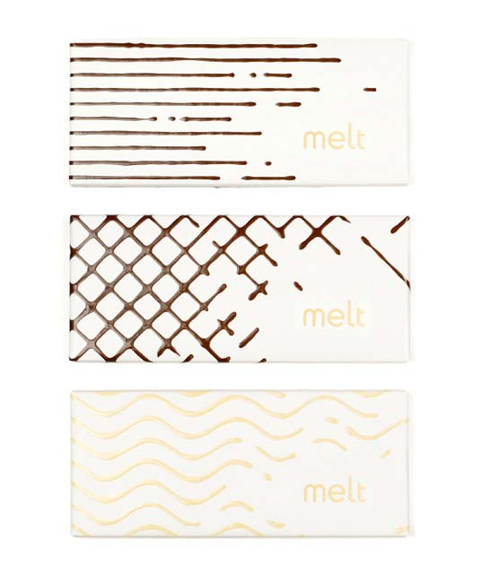
“Packaging and logo design for a gourmet chocolate shop. The classic characteristics of melted chocolate are used throughout, providing a tantalizing glimpse at the wonderfulness contained within.”
32. Bite Me Confectionery Packaging Designs designed by Vasily Kassab
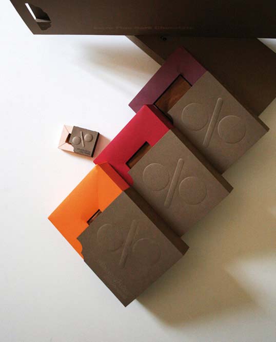
“The Bite Me brand was developed based on the concept of healthy life with correct portions. Now we can have a correct portion of chocolate since the new packaging is taking into consideration the percentage of cocoa. The more the percentage of cocoa to milk and other ingredients the bigger the chocolate size and vise versa, the less cocoa the smaller the chocolate becomes. Packaging took into consideration distinguishing colors according to different percentages as well, 70%, 80% and 90% as well as small gift chocolate. Shopping bags were customized to suit the boxes. The technique used is 100% ink free, its a play on the sense of touch, embossing, die cutting and laser engraving was used.”
33. M&S Royal Wedding Biscuit Tin Confectionery Packaging Designs designed by Kate Forrester

This vintage-inspired commemorative biscuit tin was created to mark April’s wedding of Prince William and Kate Middleton.
34. I Love Elassona Confectionery Packaging Designs designed by Sophia Georgopoulou

“For a baby-boy christening ceremony in the city of Elassona (Central Greece), small linen pouches, in brown and light blue color, were created as baptism giveaway gifts and were given at the end of the christening ceremony. These pouches contained sweets and they were decorated with small cockade pins with various slogans and in a variety of colors. The themes on the cockades were taken from the key cockade of the invitation.”
35. TCHO SeriousMilk & Purenotes Confectionery Packaging Designs designed by Edenspikermann

“How do you attract the attention of milk chocolate lovers without abandoning your dark chocolate roots? By relying on the design values practiced for four years and injecting them with a bold visual direction.
Our design for SeriousMilk is hypnotic, drawing one into the rolling optics that say creamy, smooth, you have to try me, I’m different. The illusion appears to move and flow because of the precise mathematically based composition. These “tessellations” fill the visual plane leaving the viewer wanting to move around the box edges looking for more.”
36. National Trust Confectionery Packaging Designs designed by Studio H
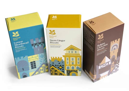
“Studio H was commissioned to re-design National Trust’s entire retail packaging, with a brief to refresh public perception and bring coherence to a hugely diverse product range. The National Trust is the UK’s largest heritage charity, preserving and protecting buildings, countryside and coastline for future generations and encouraging everyone to visit and enjoy their national heritage. It was important that the re-design reflected National Trust’s culture and engaged with their visitors.
Studio H created a range of icons depicting images associated with National Trust that can be flexibly applied across different several product ranges from chocolate to stationery. For confectionery and biscuits Adrian Johnson was commission to produce a range of architectural based illustrations.”
37. Student work Confectionery Packaging Designs designed by Bora Mesut Palas

“Logo, illustration and packaging for my package design class at Marmara University – Faculty of Fine Arts. Tatlı Şeyler (Turkish for “Sweet Things”) was an imaginary client who’s about to release some bakery decoration products like cocoa, sesame and coconut. These are the two alternatives I’ve done (metal cylinder and regular box) for the cocoa version.”
38. Nestlé Easter Confectionery Packaging Designs designed by FutureBrand
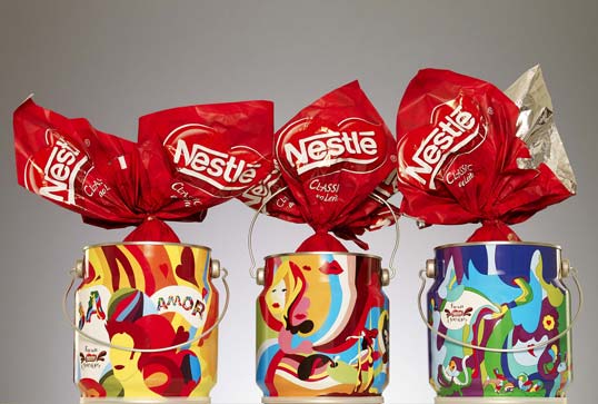
FutureBrand commissioned Brazilian illustrator Cako Martin to illustrate these chocolate egg filled metal cans for Nestlé Easter.
39. Student work Confectionery Packaging Designs designed by Camille Brunelle

“We Canadians have many traditions; amongst them is the sugar cream fudge. Recipes are passed down from generation to generation and remain a staple in our Christmas holidays and also remain a not so commercialized sweet. A simple recipe made from brown sugar and cream, mixed and cooled off before being chopped into cubes like regular chocolate fudge. When it came to the packaging of this traditional sweet, I wanted to stay close to our canadian roots, reminiscent of our past; the lumberjack and hunter jacket. The concept would be that the sugar cream fudge be moulded in the form of the buttons, as if they were the coat’s buttons themselves. The outside packaging would represent the manliness of each Canadian and the inside lace would represent the sweet and reassuring aspect of all Canadian women.”
40. Barú Confectionery Packaging Designs designed by Creneau International

“Dark and pure, rich and honest, funny and crazy … as long as it says Barú on the outside, you know you’re in for a delicious treat. Drawing inspiration from Barú’s finest fluffy, swirly and nutty chocolates and sipping from their sensational chai tea, Creneau International designed a range of packaging that put the funk back in the chocolate and the glee back in the tea.
The best chocolates are little bites of happiness and the designers wanted the packaging to show just that. Adorned with retro colours and patterns, central to each wrapping is the signature element of the brown rectangular bar with the round Barú logo in it. The packaging features an array of typefaces reflecting the crazy playfulness and wonderful taste sensations.”
41. Panda Traditional Soft Liquorice Confectionery Packaging Designs designed by Cowan London

“Cowan London have redesigned the packaging for Panda’s traditional soft liquorice, making use of the product to produce a simple, unique and distinctive pack.”
42. Moonstruck Tumbled Chocolate Confectionery Packaging Designs designed by Sandstrom Partners

“Moonstruck Chocolate asked us to help them name and develop a packaging system for a new chocolate covered fruits and nuts product line. Tumbled™ was the name that quickly rose to the top of the naming list and was much improved over the industry standard term of Chocolate Covered. The container study was a long, multi-faceted process which led us to a very unique, custom box shape. Oregon’s Western Meadowlark became a die-cut reveal to showcase the often iridescent coatings of the different tumbled products. Red illustration for dark chocolate and blue illustration for milk chocolate helps discerning consumers find their preference quickly at retail. Also integrated into the packaging design are a beaver, more Western Meadowlarks, a salmon, Mt. Hood, Doug Fir trees and of course, last but not least, a Sasquatch, which can be found on all of the new Moonstruck packaging by Sandstrom Partners. The Sasquatch is hidden in a different location for each flavor of the Tumbled Chocolate packaging line. Cut paper style Illustration by Kate Forrester.”
43. John & Kira’s Confectionery Packaging Designs designed by studio AG

“A great deal of heart goes into every piece of chocolate at John & Kira’s. Their exquisite products are made by hand with the finest ingredients available from local and family farms. “Real people, really good chocolates” is not only their tagline, it’s their business philosophy. The chocolate boxes needed to appeal to a wide audience; from the thoughtful fancy food lover, to the impulsive farmer’s market shopper. And the goal of Studio AG was to create a system of boxes that communicated the core values of the company.
For the chocolate consumer; the packaging represents the handcrafted and careful aesthetic instilled in the John & Kira’s brand. For the chocolatier; the system of boxes is extremely versatile and can be efficiently assembled easily during busy seasons.”
44. Henrik Konnerup Chocolates Confectionery Packaging Designs designed by Bessermachen DesignStudio

“These chocolates were designed in cooperation with chocolate artist Henrik Konnerup.
12,000 pieces of chocolate have been produced – 1,000 large boxes. Every piece of chocolate weighs 50 grams and can be divided into four squares, each mould with the Brandhouse symbol in the middle. All 12,000 pieces are handmade.
Every piece of chocolate and each packages design has the same characteristics as the archetypes, thereby showing how to create the personality of the brand through product development as well as packaging design.”
45. Student work Confectionery Packaging Designs designed by Martín Azambuja

“The goal was to create a vintage Chocolate Bars with direct references to swiss design. The colors use in each pack represent the flavour of each chocolate bar.”
46. Student work Confectionery Packaging Designs designed by Ivanna Shashkina

“Sweet & Hot is a product that pairs chocolate with spices. The project concept is that different faces show the varied degree of peppered spice.”
47. Moonstruck Fortunato Confectionery Packaging Designs designed by Sandstrom Partners

“Moonstruck Single Origin Peruvian Fortunato No.4 chocolate bar packaging. Moonstruck Chocolate is a Portland, Oregon based company known for making premium handcrafted truffles. This chocolate bar packaging is Moonstruck’s fourth entry into the premium, single origin chocolate bar category. The chocolate itself was described as the ultimate in single origin chocolate, so we needed to create a package that reflected this. Our goal was to create a package that families with the current Moonstruck Single Origin chocolate bar collection but would be notably more premium in look and finish. The illustration and typography continue on in Moonstruck’s now signature hand-cut paper style. The finishes include: Matte Soft-Touch (Metallic Silver areas). Embossed Glossy Diamond-Kote Varnish (White Illustration + Logo). Purple foil (Typography).”
48. Moderna Museet Confectionery Packaging Designs designed by Sissi Edholm & Lisa Ullenius

This chocolate bar packaging was created for sale during an Olle Baertling exhibition at the Museum of Modern Art in Stockholm.
49. Joakim Norman Self Promo Confectionery Packaging Designs designed by Joakim Norman

“I’ve always been intrigued by candy and confectionary aesthetics. The colors, the blissful feeling and total unpretentiousness. That’s what I wanted my own business to feel like.
So I made hundreds of chocolate business cards, bigger chocolates to give away (with a golden coupon inside, Willy Wonka style), letters in classic swedish candybag-paper style, a bag with nougats that represents my services and a big box to send to potential customers. And of course a website. Everything folded and designed hand (except for the actual chocolate, I don’t wanna poison people…) with lots of love.”
50. Student work Confectionery Packaging Designs designed by Chong-Min Kang
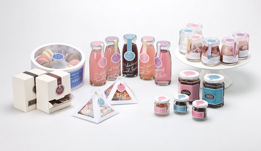
“The Berry Verry Paris is a trendy lifestyle dessert, which provides stress relief to tired modern people with its fresh and sweet flavor. This is a dessert to help relieve fatigue and restoring health by using berries. Berry Verry Paris’s design concept is sweet in color, slim in form, and uses Paris as a motif.”


