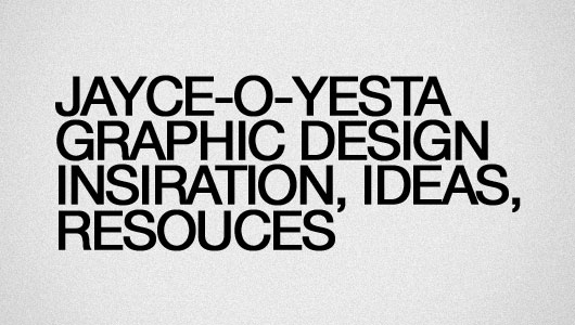
Typography plays an important role in the advertising media. Typography is an element that will be the key point of success in conveying the message of the advertisement. Good typography is not just beautiful or unsightly, but it also must be appropriate as supporting elements capable of delivering one-way communication to the target marketing. What are the benefits of good typography if it's even hard to read? It usually only changes the role as an image, image support, or simply as an attraction, it can not assert any purpose that is contained in it because it can not be read properly.
Here are the important things I have gained from various sources and personal experiences about common typography mistakes in advertising layout design:
1. Font Size

The main thing to consider is the size of the font that you use as a type of a text message, do not make the font size is too small for a title that is almost difficult to distinguish from other text, and otherwise do not also give the size is too large to be too prominent , or the contrast of the text which make the message delivered by a non-title text will be ignored. Make a list of the order to mark the type of text, such as headings, sub-headings, content, and so on. It can be used as a future reference for the size of the font.
2. Font Color

Customise the background color of the font to be easily read. Usually fonts are hard to see because the 'collision' with the background color, and it will make the message does not get to the visual reader, and also enough to irritate the reader. As the use of blog text, readers will not willingly wrinkled eyes in front of their monitors just to read your writing. Even if the content is quite important to them, they may just be copying your content to be read on their computers.
3. Too Many Fonts

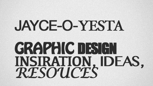
Other fatal case is the use of too many type fonts in a single layout. This is quite fatal as it can blur the focus of the message. As a result, the intent of the message would not be conveyed properly.
4. Hard To Read Fonts

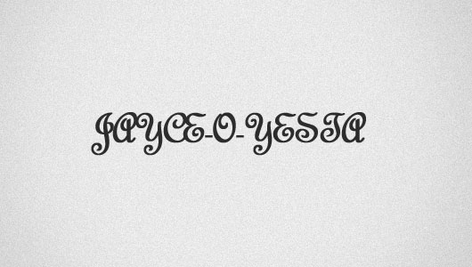
May be tempted by the shape of a font or something, but many designers may have made this mistake. Use only the appropriate font in place, then the reader is not going to stop just to see the name of a shop on a billboard which use complex fonts making it difficult to read while driving.
5. Neatness

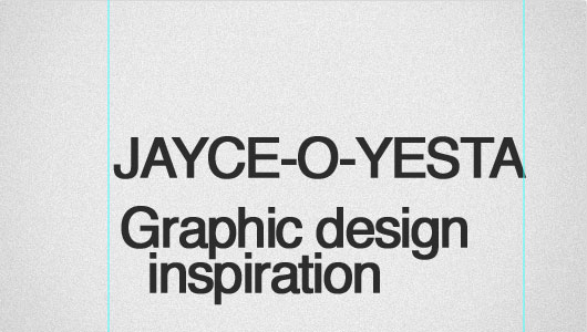
Neatness is perhaps most often overlooked by most graphic designer in developing the layout. Though neatness is the key that makes the reader interested delve further into the message contained in the media.