Featured Post Today
print this page
Latest Post
Showing posts with label Logo. Show all posts

Logo Design Tips: A Guide to Logo Design

A Guide to Logo Design
In this post, we will discuss more about logo design. Logo design is one of the fields of graphic design, it's quite interesting to be explored due to the basic design of highly refers to the concept rather than the technique. If you are interested in logo design, perhaps this article is a good start to adding your insights related to what is needed by a logo designers. Okay, Lets get started!

1. Logo, Identity and Brand


a. Logo

Logo, Identity and Brand
image source

Logo is a sign or symbol that aims to identify a company or entity. Logo does not work to sell, it only serves to represent the identity of something.

If the logo depicted as part of one's appearance, logo is the face of a person. We are used to identify a person from their face, and then we will remember it properties, behavior and so forth. So is the logo that represents the company, we recognize the company from its logo, and then remember about it's service, quality products, and so forth.

b. Identity


Logo, Identity and Brand
image source

Identity is the visual aspects that form the parts of the overall brand. Identity is the appearance of a company in a visual form, such as the use of color, images, typography, etc.. Identity usually refers to the guidelines that are designed specifically as a guide in describing the company in a visual form.

Examples of common identity consists of various visual equipment, such as stationery design, flyers, brochures, website, uniforms, signage, and various other equipment s that are categorized into visual form.

c. Brand


Logo, Identity and Brand
image source

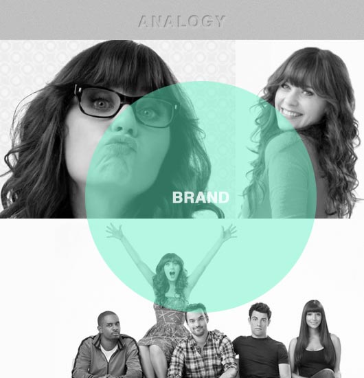
The common perception that often arises is that the brand is solely limited to logos, use of color, typography, and a slogan. It is a wrong perception about the brand. So what is a brand? A brand is the emotional perception of the company's overall image. Brands are built through a process, consistency, and commitment.

A brand will establish a positive perception if it delivers quality and good service. A company can attempt to establish a positive brand, but the decision remains in the customers. Brand consists of various aspects, such as the Brand Name (the name of a product or service), Brand Positioning (a priority market segment and type of business), Brand Management (application of marketing techniques), and so on.

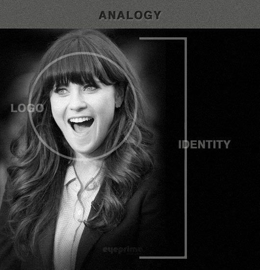
If illustrated as a person, it would look roughly like this:
logo analogy

logo analogy

When Zooey Deschanel consist of Logo, Identity, and Brand: her face would be the logo, identity would be her appearance, hairstyle, walk, smile, type of clothing worn, greasy hair, glasses, etc.. While the brand would be her attitude and behavior as friendly, loving, polite, smiling, inspiring, childish, and so forth.

2. Choose the Best Graphic Software for Logo Design

adobe illustrator splash

Logo should be designed in vector graphic format. Vector is a format which builds upon the graphical form of dots and dashes in the computer, so its size can be enlarged without limit and does not affect the resolution and image quality. It is totally different from raster format / bitmap which is built from a set of pixels from an image.

To design a logo, use only the vector-based applications. There are a variety of vector based design application that you can find out there: I would suggest Adobe Illustrator, CorelDRAW (paid software) or Inkscape (free).

3. Good Logo Criteria

Good Logo

Once you know the main functions and role of a logo, we will start with the next stage, ie to know the criteria of a good logo. Here are some general criteria used to design the logo:

A Good Logo is Simple


Less is more! Good logo is simple. The simpler the better. Because the logo is basically not assessed aesthetics but rather to function. The simplicity of a logo will help in identifying the functions represented. In addition, a simple logo is also easily applied in various types of media and tend to be understood quickly.

A Good Logo is Unique


In everyday life we will be able to easily recognize each other because everyone's face is unique. as well as the logo, the more unique a logo looks, the easier it is to stand out from the others.

A Good Logo is Memorable


Good logo is easy to remember. Logo does not require excessive elements that can actually make the audience confused. A memorable logo will help enhance the company's image and brand awareness of the company.

A Good Logo is Relevant


It is important to remember that the main function of the logo is as identification. So, try a clear relevance between the logo and the entities represented. For example logo for digital products should use symbols and typography which gives the impression of harmony with the theme and feel of the digital, technology, etc..

A Good Logo is Flexible / Applicative


Logo should be applicable and should be easily applied to a variety of visual media. Consider the factors of production such as screen printing, engraving, or 3D sign. This aspect refers to the simplicity to be built in a logo. Logos that are applicable can save a lot of production cost.

A Good Logo is Timeless


Logo will be used in a very long time, perhaps decades or even hundreds of years. For that, aside previously thought to follow the logo design trends. Remember that a logo redesign will make its use be inconsistent and confusing to customers. In addition, post-redesign costs will be enormous.

4. Letter Mark, Logo Mark or Both?
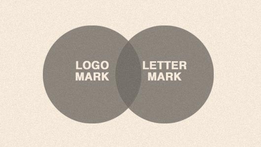

Letter Mark, Logo Mark or Both?

In general, logo classified into several types:

  • Logomark, the logo consists only of symbols.
  • Lettermark, the logo only consists of letters that usually use the name of the product / service.
  • The combination of both; logo consisting of logomark and lettermark.

"So which one should be used?"

To answer that question, we should first look at the name of the company. Lettermark commonly used in the company logo that has a unique name. This will make the company name stand out and emotionally creates a direct connection between the logo and the name.

Conversely, logomark will be good to use if the company name is too generic, eg the use of common names such as Apple, Blue, Speed​​, Water, Stone, etc.. In this case the use of iconic symbols are believed to help companies more easily identified by the audience.

5. Choosing Typeface for the Logo Design


Typography is an important element that must be considered in designing the logo. Here are some things to consider in choosing the typeface for the logo design.

Unique


We recommend that you avoid using a common font type. Some OS such as Window and Apple computers typically have a default font that has been frequently used by many people. It is better to choose a unique font, or design your own special typface for a logo.

Readability


Readability is very important factor in the application of typography including the logo design. Avoid using fonts that are difficult to read. In addition, you should avoid using effects on lettermark, like outline, shadow, emboss, etc.. It even makes the logo difficult to read.

Thickness


Logo in the application has a wide range of sizes. Make sure that the logo can be easily seen in small sizes though. For that, you should choose a font that has a sufficient thickness so easy to read. The font that is too thin will make the typeface difficult to read, and even seemed lost when the logo is reduced or when viewed from a certain visibility.

Relevance


Each typeface represents a trait that can be felt by the audience. Such as: 'solid' and 'strong' if we look at the font that has a strong thickness. Or what is 'feminine' if we see a decorative or thin font. So, make sure you choose a font that is relevant to the company represented.

Number of Fonts


Limit the use of the number of fonts for a logo. Too many types of fonts will only make the logo seem complicated.

Kerning


Spacing between letters (Kerning) is also a thing to consider when designing a logo. Be sure to not make the distance is too tight, or too loose on the typeface. Good kerning will build interesting compositions that form the logo.

6. Logo Design Process


Here are some common processes used in designing a logo:

Logo Design Brief


Logo design process usually begins with a brief, at this stage, designers try to gather as much information needed to design a logo such as: name of business, type of business, target market, corporate positioning, competitors, market segments, and so on.

Research and Brainstorming


Having collected the necessary information, the next process is the research and brainstorming. At this stage, the designer started developing the concept and looking for ideas.

Logo Sketch


If the concepts and ideas are available, the process continues by making logo sketches with pencil and paper.

Vectorizing


At this stage the results of the sketch is ready to be transferred into a digital format (vector format). Usually, the sketch is scanned and then re-tracing performed using vector-based applications, such as Adobe Illustrator.

Presentation


The next step is to present your draft to the client. Usually in the presentation, a designer will explain to clients about the concept behind the logo being designed, the use of color, typeface, etc..

Revision


7. Logo Design Resources


Here is a collection of useful resources:

Logo Design Inspiration


Logo Inspiration Community

Website and Blog

Logo Designing Articles


The logo design is not solely judged based on aesthetics alone, but also to function. Therefore, the logo design process will require research and time to be able to produce the right and communicative logo. Although the form is quite simple, but there are many things that must be understood by the designer in designing a logo. I hope this can be useful to you all, especially for graphic designers who want to explore more on logo design. If you have questions or suggestions, please feel free to comment. :)

25 Creative Restaurant Logo Design for Inspiration

Restaurant Logo Design
There are certain things to be considered when designing a restaurant Logo. If you plan to start a restaurant business, keep in mind that the restaurant logo should be easy and simple to read. However, the variance would not be free and would probably not fail to communicate your ideas. a logo for the restaurant should be able to represent the food you sell, it must be able to describe the restaurant concept, and of course it should be easy to remember.

In designing a restaurant logo, consider also that some of the unique color needs to be utilized in stimulate the appetite. Some argue that warm colors, like red and orange stimulate the appetite.

Do you realize that most fast-food restaurants are dominated by red color? Some of the most popular such as: McDonalds, Pizza Hut, Burger King, Carl's Jr. and TGI Fridays. Perhaps you think that it's just a coincidence. But maybe not.(read more:Color Psychology in Branding & Marketing)

So today, we'll be taking a look at restaurant logos. We will be showcasing 25 restaurant logo designs. We have selected some of the elegant and creative restaurant design logos for you to see! We hope you will enjoy viewing these exceptional restaurant logos and gain inspiration from them.

More Logo Inspiration:


25 Beautifully Designed Restaurant Logos


1. Logo for a sushi restaurant

Restaurant Logo Design

a well-designed Sushi Restaurant Logo.

2. Gourmet Logo

Restaurant Logo Design

Logo for a high end sea food restaurant.

3. Excelente Logo

Restaurant Logo Design

a logo that suitable for wine market, bar and restaurants.

4. Smokey's Fish-House Logo

Restaurant Logo Design

Restaurant logo done for fun.

5. Down Under Steak Company

Restaurant Logo Design

© 2011 Darren A. Price / Virtual Farm Creative, Inc. /// www.virtualfarm.com

6. Fish And Wine Logo

Restaurant Logo Design

This one is for sale. Please contact the designer if you are interested.

7. Mangioni Pizzeria A

Restaurant Logo Design

One of the unused proposals for the Italian eatery. This design combines a down to earth, relaxed, and personable aesthetic with a healthy, natural, and appetizing color palette.

8. SIDE restaurant logo

Restaurant Logo Design

Logotype made for restaurant in own style decision

9. Fishork Restaurant Logo

Restaurant Logo Design

Simple and clean logo for restaurant, bar and other food related companies. The logo is a combination between a fork and fish.

10. The Old Crab Restaurant Logo

Restaurant Logo Design

The brief asked for a design that was "Quirky, fun, playful, edgy, smart yet simple"

11. Yamato | Japanese restaurant Logo

Restaurant Logo Design

A logo for Japanese restaurant, serving hibachi, sushi, and liquor

12. Lunch Time Bistrò

Restaurant Logo Design

Restaurant logo as seen on logo-lab.it

13. Restaurant Logo

Restaurant Logo Design

food;spoon;fish,restourant

14. GlobalCuisine Logo

Restaurant Logo Design

Logo for restaurant

15. Figaro Logo

Restaurant Logo Design

Figaro logo

16. Melty Way Logo

Restaurant Logo Design

Logo redesign for a fast-casual grilled cheese restaurant concept.

17. American Harvest Logo

Restaurant Logo Design

Modern restaurant logo for nostalgic company.

18. Lobstaurant Logo

Restaurant Logo Design

A logo inspired by logo design contest for fish restaurant, where the main element were an lobster's character.

19. Cafe 422 Logo

Restaurant Logo Design

Logo/emblem concept that I have done for a contest proposal. Client was a restaurant/coffee place that serves fresh, homemade coffee.

20. La petit bouche Logo

Restaurant Logo Design

La petit bouche was first a logo concept that I have done as a contest proposal and then I decided to change it a little bit and make it my own personal project. It represents logo for a french fast food restaurant and bakery.

21. Los Artesanos / Restaurant - Bar Logo

Restaurant Logo Design

Los Artesanos is a proposal I made for a client at first, then it becomes in a WIP because I decided to be a partner and open together our own restaurant. For the moment it´s only an idea... We have to work together to become it in a fact.

22. Bistro Logo

Restaurant Logo Design

Logo for a restaurant.

23. Bison Logo

Restaurant Logo Design

Logo for a Steak house

24. Agriristoro logo

Restaurant Logo Design

A logo for a typical Restaurant in Umbria (Italy). The Client wanted something that represent three symbols, the wine bottle, the fork and the Temple of Clitunno (UNESCO heritage)

25. Food winne

Restaurant Logo Design

Food winne B&W// Restaurant Logo

Integrate Fonts Into Logo design

Integrate Fonts Into Logo design
Lately, I've been getting many emails from fellow designers asking for suggestions on designs they're working on (which is usually a Company Profile or Identity Design). Many are asking questions that do not have a simple or short answer, such as "which font looks best?" I’m sorry to say I just can't help you determine which typeface looks best without the design approach.

Integrate Fonts Into Logo design

These questions got me thinking, I had to analyze my approach and try to find answer. Apart from the answer, explanation was also very important. And now I'm finding ways to redefine and rethink the way I design, the way i make a choises, so here are some tips and methods I have outlined to assist you in determining typeface to be more relevant for a logo as well as to improve your typography decisions.

Integrate Fonts


Know the History of Font Making


"Is it necessary that you know the history of font making and text?" "Is it necessary that you know when to use a sans-serif or a serif font?" The answer would be yes. Choosing an appropriate and relevant font to the logo design starts from the basic understanding of the history.

Know the History of Font Making

A good type designer / font designer are not only merely create beautiful fonts, but the typeface itself is designed to fit on a particular era or style of contemporary and fits in a specific medium. Instead of telling the history of typeface, here are some articles and books for further explanation and learning.


I'm not saying that you need to know to learn all the things contained in the article about any tipeface there, but doing some homework will take you to a way which takes considerable time in choosing the best font solutions for your logo design.

Get a Feel of the Curve and Shape


Next time you select a font, try to zoom (zoom in) and then analyzes the curves and shape of a writing sample.

absara and bienetresocial

Let us compare the lowercase letter 'A' on FF Absara and Bienetresocial (free font); letters A to Absara typeface has a sharper curve and straight in comparison with Bienetresocial which has a circular curve (rounded). Letterform Absara writing-carved look to emerge, while Bienetresocial look more fluid and smooth.

So what can be done by knowing the above when determining the typeface of a logo? Well, a logo design with drastic angles and corners will probably look better when paired with Absara, because the expression tipeface Absara way more noticeable characteristic that represents the logo, while the logo design that has a typical circular or obtuse angle would look better when combined with Bienetresocial.

Also, many logo designers will redesign or modify an existing tipeface to get a logo blend with suitable feel.

Characteristic


Just like when you define music, car, or home design, it must be in accordance with your personality right? Now let's look at the Public Gothic (free font). As the designers stated that the character is 'industrial or slightly vintage'. Now let's look at the use of Public Gothic on the proper use (not related to the logo, but for the purposes of the example).

Below is the website of Happy Cog'aoke, designed by 'Happy Cog', is using Public Gothic as the masthead (the head of the newspaper or headline) Happy Cog'aoke them.

Happy Cog'aoke

Typeface or design elements on their website areas compliment each other well. Characteristics 'industial vintage' of Public Gothic texture goes well with the background and used a line similar to the circuit box on the website. A winning combination of a great overall look of the website.

Think about the look / taste-display and feel of the market, your client's target market, and the overall impression that you're trying to give through your logo and then combine it with the characteristic / personality type font (including puns in it). If you are in conditions that do not allow you to specify keywords that are similar among the target market, sign / symbol, and or tipeface then there must be some place-something that needs to be adjusted, removed and modified. Actually this is the purpose of graphical knowledge.

Contrast


Contrast is important in a design, it gives the differences and emphasis where it is needed. Try to incorporate the sign or form a thicker-more striking with a thinner tipeface to add atmosphere, space and or emphasis.

For example, a new identity for Armani Exchange (A | X) using a combination of thick, solid, and firm square with a tipeface that has good contrast with the thin lines to add contrast to the emphasis areas of squares and lines thicker to add a niche the black square.

armani exchange

It is also a good example of an emphasis on shape and form, as a thing straight, long and horizontal, Serif standing perpendicular to the line of the square. Which brings us to the next point in common.

Similarity


In contrast (again, including puns) in the above, try to balance the weight of the tipeface logo mark that has been selected to create a stronger relationship ties.

Let's look at the following examples Exact identity. The lines on the symbols 'equals' (=) as thick as the thickness of the form letters in the word 'exact'. This creates balance and relationship between the two design elements are separate from each other and work to bring them together. Instead the emphasis we now have the element of uniformity.

exact

Readability


When designing for any medium or subject, you should not let a style blocking design. More important, the style should not hinder usability, and in this case is the readability of a tipeface.

Readability

Choose a logo that is not only good to use on the large size, it should also excellent in a small size. Make sure it looks perfectly fine in 18-point font size on your screen, but remember that the logo is often placed at a narrow corner or on a business card, it requires the ability legibility at very small sizes.

When testing a tipeface, do not forget to shrink their size on the screen as an additional step when printing them on the small size. If it's hard to read it is probably not the best solution.


Finally, two thoughts


Contrary to the above, according to the basic principles - a logo should not be made based on a sign or symbol. Many of the most successful logos are those that use paper-based logo (logotype) that is memorable and wonderful, featuring tipeface or custom design type.

Secondly, the integration of the logo typeface is not only associated with the logo and symbol mark. Many of these tips above can also be used in all these forms of typography-to determine the headline for an article, for example, is a technology or a way to determine the hierarchy of a bird-themed books.

Not to say that you should start designing tipeface or simply knowing how to identify each tipeface on the market, but to have a strong understanding of typography, rules, and history will take you and the results of your design on a long journey.

50 Creative Animal Logo Design for Inspiration

Creative Animal Logo Design for Inspiration
Some fellow designers may think of designing a logo that will be used as the identity of a company is a difficult task which can affect their creativity. In fact, designing a logo is not always complicated. The point is, a logo designer should be able to capture the company's strong character - the uniqueness that distinguishes it from its peers-and then pour it into a design.

Inspiration can be drawn from anywhere, such as the environment around you, nature, until the general types of animals. With a little creativity, the object of animals can also be converted into a charming logo. Today I'm going to show you some creative examples of animal logo design! Most of these logos is the form of animal symbols, some of them carrying the minimalist theme, some are also very colorful, and interesting. Enjoy

More Logo Inspiration:


50 Creative Animal Logo Design for Inspiration


1. Gorgeous Invitations Logo

animal logo design inspiration

Logo for our new brand "Gorgeous Invitations"

2. oINK Logo

animal logo design inspiration

Logo for any company. clean and simple, color, slogan and minimal change customizable for free after payment. Conceptually: cute design between ink and pig, with the slogan Oink. can be used in art shops, design, or anything related with ink and pigs.

3. La Tortue Logo

animal logo design inspiration

Used for a blog called La Tortue

4. Owl Logo

animal logo design inspiration

As usual a logo I did for fun. I usually like to sketch out animals and make logos once every week or two weeks.

5. Fantail Logo


animal logo design inspiration

fantail logo design

6. Bicho Zen Logo

animal logo design inspiration

Description: New logo for a premium pet shop chain.

7. Rhino Logo

animal logo design inspiration

Description: Rhino Logo design

8. CMM Logo

animal logo design inspiration

Description: unused proposition for Cut Mistake Music logo

9. CMM Logo

animal logo design inspiration

unused proposal for Cut Mistake Music logo

10. antiqua Logo

animal logo design inspiration

Antiqua logo design

11. Búha Logo

animal logo design inspiration

This is the logo design blog.

12. Forrestwood Logo

animal logo design inspiration

A world full of creatures.

13. Dog Logo

animal logo design inspiration

Unused proposal logo design

14. Burloak Animal Hospital Logo

animal logo design inspiration

a logo design for Burloak Animal Hospital

15. vasduck Logo

animal logo design inspiration

children's winter clothing logo design

16. Silver fox Logo

animal logo design inspiration

making for trening

17. Elephant Mail Logo

animal logo design inspiration

Unused Proposal.

18. Wolfpack Sports Logo

animal logo design inspiration

Logo design for Wolfpack Sports

19. Zookeeper Records Logo

animal logo design inspiration

A logo for the record company based in Salt Lake City, Utah.

20. Saranac Untamed Logo

animal logo design inspiration

"This was a student project I did while at RIT. I wanted to create a new, young, fresh, logo for a hypothetical beverage line for Saranac Beers"

21. Tierarztpraxis Dr. Knorr Logo

animal logo design inspiration

Logo for a veterinary practice.

22. Kowboi Hotshot Logo

animal logo design inspiration

Identity for a local oilfield hotshot service

23. The Beast Within Logo

animal logo design inspiration

Who is really the beast?

24. MOETIVS Logo

animal logo design inspiration

Clothing/Fashion, USA

25. Animal Pond Logo

animal logo design inspiration

Pet Care Hospital logo design

26. mecroo.com Logo

animal logo design inspiration

bionic jumper ...

27. The Lion Brand Logo

This is the new version of the logo. I changed the typography "Brandom Grotesque", now used "Geared Slab" and "Wisdom script" (thanks to Lost Type Co-op and his great work) and I added more details.

animal logo design inspiration

It is not yet the final version, but I think I'm on the right track. What do you think?

28. IGCP Logo

animal logo design inspiration

Attempt to rebrand the original IGCP logo (International Gorilla conservation program).

29. Texan Toro Logo

animal logo design inspiration

Logo for steak house restaurant

30. bokk Logo

animal logo design inspiration

I recently realized I've never designed anything animal related. So I decided to give it a try with this ibex.

The logotype was custom made and incorporates characteristics of the ibex. (The name bokk is derived from the word sprinbok.)

31. The Polkadot Fox Logo

animal logo design inspiration

The Polkadot Fox logo design

32. Fishork Logo

animal logo design inspiration

Simple and clean logo for restaurant, bar and other food related companies. The logo is a combination between a fork and fish.

33. ARTEMIS Logo

animal logo design inspiration

Unused proposal

34. Paper Bird Logo

animal logo design inspiration

Simple and clean logo good for design and creative companies.

35. reality media Logo

animal logo design inspiration

nothing set, the client runs an image processing and analysis company. The name hasn't been decided.

36. avolio pet shop Logo

animal logo design inspiration

logo concept for avolio pet shop

37. Videoape Logo

animal logo design inspiration

Ready made logo design

38. Kramnik1 Logo

animal logo design inspiration

proposal for a DJ and producer

39. Color Dog Logo

animal logo design inspiration

A logo based on colored glass

40. Cock Logo

animal logo design inspiration

Animals.. eternal inspiration :)

41. Impala Logo

animal logo design inspiration

Impala in profile. African sun in the background.

42. Buffalo Logo

animal logo design inspiration

financial institution logo design

43. kk Logo

animal logo design inspiration

King Kock - Fashion logo

44. Magus Vulpes Logo

animal logo design inspiration


Magus Vulpes logo design

45. OKstag Logo

animal logo design inspiration

A stag with it's horns shaped as an "O.K." sign

46. Penguins - ice cream Logo

animal logo design inspiration

Penguins - ice cream logo design

47. Monk - Exercises Logo

animal logo design inspiration

Some say playing around - I say playing around. Rats with pieces of cheese.

48. Dog Charity Logo

animal logo design inspiration

Logo mark for a dog charity care and shelter.

49. Ferret love Logo

animal logo design inspiration

Ferret love

50. Nicolas Boishardy Logo

animal logo design inspiration

A logotype for a dog fancier.

 
Support : Creating Website | Johny Template | Mas Template
Copyright © 2011. Tutorials Blogger - All Rights Reserved
Template Created by Creating Website Published by Mas Template
Proudly powered by Blogger