Featured Post Today
print this page
Latest Post
Showing posts with label Interface. Show all posts

4 important things in slicing Web graphics

4 important things in slicing Web graphics
In the field of website design (interface), there are some things you will find that which is different from print design. If you are a graphic designer who is familiar with print design but want to try the field of website design or interface, you'll probably find some unusual technical terms. One of them is Slicing web pages.

What Is Slicing?

Slicing is a technique of cutting the pictures or designs on the website, breaking them into pieces and then put back together using CSS and HTML code. Why these should be break into several parts? a website display that looks intact is not the same as when you see a brochure that is really a complete printout of a design.

All the elements (images, design) emerged from the results of image pieces when slicing. They can be seen when you click on 'save as Web Complete' you will find a folder that contains the pieces of the image. That's the result of slicing. Slicing techniques can certainly speed up the process of downloading the website in parallel, but keep in mind also for not too much make the slice, because it can actually slow the downloading time due to limited number of parallel downloads on the browser.

4 important things in slicing Web graphics

slicing is the process of dividing a single 2D user interface composition layout (comp) into multiple image files (digital assets) of the graphical user interface (GUI) for one or more electronic pages. It is typically part of the client side development process of creating a web page and/or web site, but is also used in the user interface design process of software development and game development.

The process involves partitioning a comp in either a single layer image file format or the multi-layer native file format of the graphic art software used for partitioning. Once partitioned, one would save them as separate image files, typically in GIF, JPEG or PNG format in either a batch process or one at a time. Multi-layered image files may include multiple versions or states of the same image, often used for animations or widgets.

source:wikipedia


4 important things in slicing Web graphics


1. Crop tool / Slice tool


4 important things in slicing Web graphics

4 important things in slicing Web graphics

Each designer has its own ways and tactics and in doing different projects. That's fine, the important thing is that we can work fine in a timely manner. Slicing techniques in Photoshop can be done using the Slice tool or manually with the Crop tool. I personally prefer the crop tool. If using a slice tool, you can indeed be automatically cut off some parts at once in one 'slice' and instantly save for web in a single folder for all files of these pieces.

But this will make it difficult if the file is a transparent file which is lay on a background. Well, could it still be done, but it would be easier for the programmer if we split up the image files with transparent background. Well, it still can be done, but would not that be much easier for the programmer if you split up the transparent image file from its background? :)

2. slicing the tips and middle of the background


For slicing a field, for example in the background or on a curved corner box (with a rounded rectangle) certainly has a way to cut each. If to be cut is a field box, eg for background writing with pointed toes then you just need to thin cut on one part only.

4 important things in slicing Web graphics

4 important things in slicing Web graphics

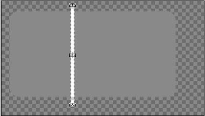
Meanwhile, if the area to be cut has curved corners, you just need to cut on the tip of the left-right or top down (depending on the direction of the effect of gradation if any) and the center.
4 important things in slicing Web graphics

4 important things in slicing Web graphics

4 important things in slicing Web graphics

Why just need to cut or thin like that and that's only 3 parts? Because later on when you want to create a code (html / css), if the same field and the texture or without texture, the code will unite with the repeat result is the center piece (either vertical or horizontal direction). In contrast, if the image is an image or texture that is not evenly distributed, of course you can not use the 'repeat' code, which causing messy result.

3. Gradation Slicing


As discussed earlier, the slicing technique for graded fields depend on the direction of gradation. Horizontal or Vertical. If it is horizontal with a curved tip, then you cut the tip of the left, center and right end.

But if it is vertical with a curved edge, the part that you need to cut is the tip top, middle and lower end. Let the programmer to repeat its middle course. Let the programmers who repeated the middle. The figure below is an example of a pointed tip, so it only needs one piece only, the programmers who will repeat it later.

4 important things in slicing Web graphics

4 important things in slicing Web graphics

4 important things in slicing Web graphics

4 important things in slicing Web graphics

4. Folder Naming


For slicing files naming, its important to remember that you can not use spaces, for example, you're going to name an image with '05 ', then you should name it with'image05'or 'image_05'. Because the HTML code can not read files that using spaces on it's name. Its better to use a numbering or alphabetical order to ease the programmer when opening the these file, especially for a sequence file. All must be in one folder only, not separate nor a folder within a folder.

4 important things in slicing Web graphics

Conclusion


At first, to the designer who is unfamiliar in terms of slicing, may be confused about where to start, or what should be dislicing. For the slicing process is only required graphics software, for those of you who are familiar with graphics software certainly had no difficulty during the process of slicing.

If you have difficulties to determine the slicing, you better to discuss it with your programmer / coder, because they who later received the results of your slicing and then put them together into a whole web page.

Web Design: Attract your Visitors with a Worthy Design

Web Design: Attract your Visitors with a Worthy Design
The first impression of a web will be created in the first 9 seconds on the first visit. So how does a website designer can draw the attention of its visitors? The answer is: with a 'Worthy Design'

Web Design: Attract your Visitors with a Worthy Design

a 'Worthy Design' means,

  • Has a good color coordination
  • has a nice layout,
  • and most importantly, it must be quickly load.

The basis of Worthy Design


The basis of design "worthy", is to create a layout synergy using color, shape, and typography. The combination of the three elements may form a design that represents the contents, and in accordance with the intended target audience.

Web Design: Attract your Visitors with a Worthy Design

A visitor will respond to what they see (on the display monitor) on a psychological level either consciously or not. A designer-good graphics, should be able to arrange the elements that can be fun and satisfying its visitors. And its purpose is not completed by the visitor alone, but a happy visitor most likely will respond to what would be the purpose of your site (Purpose of the site could be just for a hobby, or for entertainment, or perhaps to sell goods and services).

The best way to attract the attention of a visitor is with the use of appropriate colors. But do not forget the shape, it is something that is often forgotten, the shape is a design element that is strong enough to form an image, and in expressing the information.

Oh wait, one more is typography (typeface selection). Typography at present has limited implementation in web design, but it is a very important element in communication with the visitors.


Colors


Web Design: Attract your Visitors with a Worthy Design

Color selection is one thing that is important in determining the response of the visitors. Color is the first thing seen by a visitor (especially the background color), and you can make your site to display the first color while the other content (text and images) is being downloaded. This will make an impression or a mood for the entire site.

To achieve effective color design, you can start by choosing a color that can represent the purpose of your site. Color pallet that you create should match the purpose of your site. If for example your site is a community site, then you should choose warm colors to create a relaxed mood or impression. Or if your site is for information sites, where content will dominate, then the color should be simple and unobtrusive (eg do not use flowery background with a garish colors).


Form


Web Design: Attract your Visitors with a Worthy Design

Forms can also be used to draw a response from visitors. Effective Use of Forms will psychologically motivate, inspire, and provide a challenge to visitors, sometimes the visitors do not realize why they are motivated.

Form, usually can be combined to make a stronger impression. For example the use of a circle and a triangle will generate the energetic, and dynamic impression. Or the use of a circle and a square for warmth and safety feeling.

Strength and the combination of forms has been applied in various fields, such as automotive, architectural, packaging, and company logo


Typography


Web Design: Attract your Visitors with a Worthy Design

Typography is an art. And is an art that is quite complicated, especially its complexity plus the limited space of a web.

font on the web can be made as part of the graphic (image), or with HTML, and Style Sheets (CSS).

Using HTML and Style Sheet, sometimes will get less satisfactory results because the typeface we use, may not be available at the visitor's computer. If a type of font (selected font that have been set by the web designer) is not installed on the visitor's computer, then the font that will appear on the visitor's computer is the alternative or standard font (by default).

Designers can also specify the letters in graphical (image), and also the general typeface used in the text.

So many forms of letters, so difficult to say how many fonts that exist in this world. So it's rather difficult to determine the effect / impact that can be generated to the visitor. However, the letters are divided into several general categories, and usually these general categories has its own style.

Typically, designers will use several types of fonts in a page. Decorative and script font type use in Headings and important points, and Serif or San-Serif for text content (or sometimes use a Monospace).

To affect the visitor psychologically, can be done with the use of typeface in accordance with the objectives to be achieved, as well as with the use of color and form.

5 Points of Effective Corporate Website

Effective Corporate Website
Corporate website or company website is key element of building brand in online. It also usefull to get new clients in addition to its function to provide information.
On this occasion we will discuss some key elements that must be contained on a corporate website design. Ok,lets just get started.

Slogans and taglines for company

Could be part of the logo, or not. But to be sure, the function of the tagline is to summarize product or services offered by companies to consumers. So that visitors already know the outline of the company instantly. It usually use 2 words to 2 short sentences, if it exceeds that, it would be "a tagline" no more.

Company Information and Contacts

Certainly, this section must exist in corporate websites, this allows visitors to get to know the background of a company, services offered, even to the board of directors if necessary. contact info is also very important, including phone numbers, email and a certain address. the addition of a map of the address would be great (You could use Google Maps service).

Services & Products Offered + Pictures

Product info must be communicated with ease so that visitors can quickly capture the goals of this company and about the benefits to be obtained by consumers. Better yet, if it comes with the photo of the product. It's recommend to use the services of professional photographers to highlight important elements which exist in the product.

Some companies are selling intangible products (services and digital goods). For this case, we can just using the actual product image . It Can be a portfolio or photos of event that being held (for event organizer Company). The point is to display the products on offer as clearly as possible.

Call to action

Usually a button with the words e.g "Order Now - Get 35% Discount." Could also be as simple as: "Contact Us Today!". The goal is to convert visitors into potential clients that we can contact and eventually can become our client. In the end the goal of all commercial websites are for conversion isn't it? :D

Blog/News

This section is usually ruled out on the corporate website. However, if it's used properly, even a blog can be one effective marketing media without having to throw a big expense. Use a blog / news to provide interesting info relating to products or services from a company other than as a media company press release.

Trek


Sustain Ability


Scout


Intel


Idc


Goldman


Dyson


Duchy Originals


Aol


Conclusion
A design of a corporate website does not have to be boring. In order to produce designs like the example above we must first explore the vision, culture, products and value of the company. After that we just may decide to highlight important part of the company, only then we went into the design stage that can support the vision, culture, products and value of the company without forgetting the element of easy communication received by visitors.

What do you think? Does corporate website design that must forever boring? Or is there another way for the company's website can be the center of world attention over the internet? Please share your thoughts in the comments section :)
 
Support : Creating Website | Johny Template | Mas Template
Copyright © 2011. Tutorials Blogger - All Rights Reserved
Template Created by Creating Website Published by Mas Template
Proudly powered by Blogger