In the field of website design (interface), there are some things you will find that which is different from print design. If you are a graphic designer who is familiar with print design but want to try the field of website design or interface, you'll probably find some unusual technical terms. One of them is Slicing web pages.
What Is Slicing?
Slicing is a technique of cutting the pictures or designs on the website, breaking them into pieces and then put back together using CSS and HTML code. Why these should be break into several parts? a website display that looks intact is not the same as when you see a brochure that is really a complete printout of a design.
All the elements (images, design) emerged from the results of image pieces when slicing. They can be seen when you click on 'save as Web Complete' you will find a folder that contains the pieces of the image. That's the result of slicing. Slicing techniques can certainly speed up the process of downloading the website in parallel, but keep in mind also for not too much make the slice, because it can actually slow the downloading time due to limited number of parallel downloads on the browser.

slicing is the process of dividing a single 2D user interface composition layout (comp) into multiple image files (digital assets) of the graphical user interface (GUI) for one or more electronic pages. It is typically part of the client side development process of creating a web page and/or web site, but is also used in the user interface design process of software development and game development.
The process involves partitioning a comp in either a single layer image file format or the multi-layer native file format of the graphic art software used for partitioning. Once partitioned, one would save them as separate image files, typically in GIF, JPEG or PNG format in either a batch process or one at a time. Multi-layered image files may include multiple versions or states of the same image, often used for animations or widgets.
source:wikipedia
source:wikipedia
4 important things in slicing Web graphics
1. Crop tool / Slice tool


Each designer has its own ways and tactics and in doing different projects. That's fine, the important thing is that we can work fine in a timely manner. Slicing techniques in Photoshop can be done using the Slice tool or manually with the Crop tool. I personally prefer the crop tool. If using a slice tool, you can indeed be automatically cut off some parts at once in one 'slice' and instantly save for web in a single folder for all files of these pieces.
But this will make it difficult if the file is a transparent file which is lay on a background. Well, could it still be done, but it would be easier for the programmer if we split up the image files with transparent background. Well, it still can be done, but would not that be much easier for the programmer if you split up the transparent image file from its background? :)
2. slicing the tips and middle of the background
For slicing a field, for example in the background or on a curved corner box (with a rounded rectangle) certainly has a way to cut each. If to be cut is a field box, eg for background writing with pointed toes then you just need to thin cut on one part only.


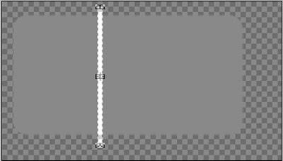
Meanwhile, if the area to be cut has curved corners, you just need to cut on the tip of the left-right or top down (depending on the direction of the effect of gradation if any) and the center.


Why just need to cut or thin like that and that's only 3 parts? Because later on when you want to create a code (html / css), if the same field and the texture or without texture, the code will unite with the repeat result is the center piece (either vertical or horizontal direction). In contrast, if the image is an image or texture that is not evenly distributed, of course you can not use the 'repeat' code, which causing messy result.
3. Gradation Slicing
As discussed earlier, the slicing technique for graded fields depend on the direction of gradation. Horizontal or Vertical. If it is horizontal with a curved tip, then you cut the tip of the left, center and right end.
But if it is vertical with a curved edge, the part that you need to cut is the tip top, middle and lower end. Let the programmer to repeat its middle course. Let the programmers who repeated the middle. The figure below is an example of a pointed tip, so it only needs one piece only, the programmers who will repeat it later.


4. Folder Naming
For slicing files naming, its important to remember that you can not use spaces, for example, you're going to name an image with '05 ', then you should name it with'image05'or 'image_05'. Because the HTML code can not read files that using spaces on it's name. Its better to use a numbering or alphabetical order to ease the programmer when opening the these file, especially for a sequence file. All must be in one folder only, not separate nor a folder within a folder.

Conclusion
At first, to the designer who is unfamiliar in terms of slicing, may be confused about where to start, or what should be dislicing. For the slicing process is only required graphics software, for those of you who are familiar with graphics software certainly had no difficulty during the process of slicing.
If you have difficulties to determine the slicing, you better to discuss it with your programmer / coder, because they who later received the results of your slicing and then put them together into a whole web page.


