For graphic designers, the presentation is a mandatory thing to do. Whether it's a must, inevitably. I often find my friend who has some good work but it failed during the presentation. I don't know why but maybe it because of the lack of readiness, stage fright or because the nature it self.
1. Formula
This time I'm going to share some tips that might help you. Starting from how to use the slide to the present stage. I personally think a good presentation that can be described as follows:

The good news is, some people hate public speaking. It's okay if you fall into this category, you are not alone! Reasons such as dull, horrible, no good at talking, less sure sounds popular. But by following tips from me might be a lot of help.
2. Number of slides

More slides are better. They can keep time and rhythm of your current presentation. Some say:
Minimal preparation + Badly Designed PowerPoint = Maximum boredom (Failure!)
This way could be a little help for those who are not very good at talking. Due to the number of slides, the audience will be guided into your world one by one.
Yesta's Tip:
ADJUSTING THE NUMBER OF SLIDES WITH TIME HAS PROVIDED.
3. Less is more
Not reducing the number of slides, but what is on the slide. Here are examples of interesting presentations you can see.

It's not that I'm trying to show that I am a fanboy or anything. But here you can see what is done by Steve Jobs is much more better, more iconic. Speak briefly. If it requires a lot of points, it is better to separate the pages. The audience will more easily catch your point rather than directly to make one as did Mr. Gates. As the picture below.


Less text is better! The resulting impact will be greater.
4. Humor
IMPORTANT! Or your audience will look like this.

But it should not be too hard, just relax. You do not need too much dramatized when bringing a serious topic. Just relax, just like people talk, to flow.
5.Rehearsal
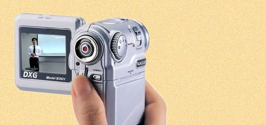
Preparation is everything. If you do not feel ready, then you've failed before you start your presentation. With practice you can manage at least flowchart or flow of your presentation. The best thing I often do is to record it with camera. Use your cell phone that has a video record facility.

Use this feature and see the results. You can fix the things that you think is not appropriate for your presentation.
6. On the stage
If you are not a person who was invited, I mean as a public speaker at the seminar, the first impression is everything. Basically, the audience is always judging from the cover first. Do not ever think that you are an Anthony Robbins. Remember! you are not him.

Yesta's tip:
* Perform a greeting. If you are not the first, use a festive greeting can make the eyes of the audience is always fixed on you.
* Bring your personal belongings, eg notebook or flash. Think of it as the seminar came the committee did not have adequate facilities, you're well prepared.
* Always provide a backup file. You never know what will happen later.
* Before you go up or go forward, wash your face. IMPORTANT!. Useful to eliminate fatigue and stress facial features.
* Never insert your hand into a pants pocket, it's very unsightly!
* Do not do a lot of movement such as shaking the body, etc..
* Do not be too much to eat and drink before the presentation.
It was just a few tips that I can share at this time. Oh, please share your experiences during a presentation. I would love to get it!


