This is a practical guide on how to make a logo. This guide has been widely used by designers of a world famous logo and it proved effective to create the famous logos, functional, and able to win the attention of target consumers. Hopefully this brief guide can contribute and be a source of learning for those who dig the field of logo design.
Some important steps that must be considered in the design of the logo include:
1. Research

Research is the most important factor when you start to design a logo. Doing research will bring some information about the company that will be useful as a basis and guidance in creating the concept. Start doing research by studying the company's clients, both in terms of strengths and weaknesses as well as the unique and services offered by companies to consumers.
Develop a research to find out who will be the company's target consumer. Find the average age, economic ability, lifestyle, and their social status. This information is useful as a benchmark for the logo will be able to fit and be accepted by the intended target market. Research also includes basic information about the client's competitors. You'll also learn about the concept of branding used in the client's competitors to introduce their brand.
2.Concept

After the research phase is completed, and after you get enough information about the company, then we will go to the stage of transferring this information into a draft. The concept refers to the guidance on how the logo will be designed. At this stage, we will go through a process to find the right idea to be transformed into a logo.
Then how is a generic way to perform an effective and frequently used in finding the perfect ideas and concepts? the answer is with mind mapping. Yes! mind mapping, by doing that you will find the ideas with a simple process, namely by mapping each of your keywords that may be associated with the company. You can read more about mind mapping in graphic design here: Mind Mapping In Graphic Design.
In addition, this phase also includes a search of inspiration associated with the project logo that is being done. We begin by looking logos from companies competing to see how they reflect their company through a logo. See also the general trend that the logo used in the industry concerned. This process will give us information to show something unique and different from competitor companies.
3. Sketch

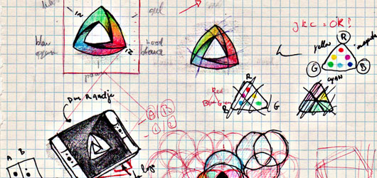
The sketch is an important process where we can find various possibilities quickly in a short amount of time. Agency branding and visual identity in the world famous like Landor also still rely on the sketch in the process of making a logo. So do not rush to plunge into the computer. give more time on the sketch until you find some form suitable for execution in a digital format.
Use variations of the logo in the sketch. For example, a logo with an icon, logo without icons, and the merger of the two. Unless there are special restrictions from clients about how the type of logo they wanted.
4. Execution

This stage is a process of a technical nature. Here you start transferring the sketch into a graphics software like Adobe Illustrator, CorelDRAW, or Inkscape. I recommend not to use raster-based applications such as Photoshop since the logo must be scaled to any size. Vector image processing applications remain the best option because the image resolution is not affected.
In this execution phase, you should already know how to draw a vector with good to excellent yield curve so that the logo looks good for viewing. You should also start with black and white display. A good logo in black and white display will also be good in a color display. Also, learn typography and basic principles of using color in graphic design.
5. Trial

There are several trials / small test to be done on the logo to test its function.
*do the experiment by displaying the logo in a variety of sizes, note if the logo will lose shape in small sizes.
*try to place it among the corporate logos of its competitors and wel-known logos. See if the logo enough to attract interest and have a unique characteristic that distinguishes it from others.
*see when it is combined with a varied background as a light, dark, and textured ones and or with images as background.
6. Evaluation

Position yourself as the target customer and ask yourselves a few things when you see the logo:
1) How do you feel when you see the logo?
2) Is it sufficiently relevant and able to explain what is offered by the company?
3) Is it unique enough to easily remember?
4) Does your logo build your trust of the company?
5) Does it shape visually beautiful and interesting?
6) Is it enough to attract attention?
7. Feedback

Finally, get feedback or constructive input. Feedback is also an evaluation but involving other people. It is important to absorb opinions, suggestions, and constructive criticism before it started to be presented to the client's logo. You can start it from a friend nearby.
Well, how do you think? if you have an opinion, additions, and input, please share with others


