Featured Post Today
print this page
Latest Post
Showing posts with label Font. Show all posts

25 High-Quality Free Fonts Collection for 2013

download free fonts
Whatever design you take, it's hard to ignore fonts. Yep! font has become one of the most important elements in a graphical work. And fortunately there's always a quality fonts distributed for free by the best typographer worldwide every day. Well, since 2012 has come to an end, here is a collection of high quality font in 2012 which you can download for free. Have fun and Happy New Year 2013!!

free fonts download

Best Free Fonts of 2012


Abraham Lincoln Font | Download


Free Fonts Collection

Blanch Font | Download


Free Fonts Collection

Bree Serif for Free | Download


Free Fonts Collection

cassannet Free Font | Download


Free Fonts Collection

Chrome Light. Free | Download


Free Fonts Collection

Geared Condensed Slab Serif Font | Download


Free Fonts Collection

Great Vibes Font | Download


Free Fonts Collection

Hagin Free Font | Download


Free Fonts Collection

INNERCITY Free Font | Download


Free Fonts Collection

Lavanderia Script Font | Download


Free Fonts Collection

Otama e.p. Font | Download


Free Fonts Collection

Snippet Font | Download


Free Fonts Collection

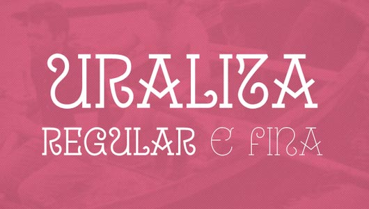
Uralita Font | Download


Free Fonts Collection

ZIAMIMI + DAMIER Free Font | Download


Free Fonts Collection

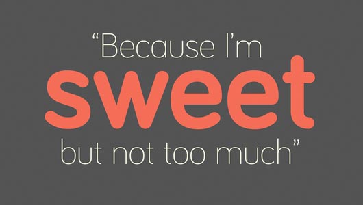
Bariol Free Font | Download


Free Fonts Collection

Carton slab-serif | Download


Free Fonts Collection

Homestead Slab Font | Download


Free Fonts Collection

Manteka Free Font | Download


Free Fonts Collection

Metropolis free font | Download


Free Fonts Collection

Novecento Font | Download


Free Fonts Collection

Rex Free Font | Download


Free Fonts Collection

Ribbon Font | Download


Free Fonts Collection

Sablon Type Free font | Download


Free Fonts Collection

Stroke Free font | Download


Free Fonts Collection

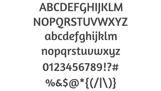
Amaranth Font | Download


Free Fonts Collection

So, which font do you like best?

Ways that Fonts Can Enhance an Image

Ways that Fonts Can Enhance an Image
In the world of graphic design, fonts can set the tempo of what the image for a business pertains to. A font can immediately tell the viewer of professionalism, business practices, and how the business conducts itself. Choosing a typeface means more than just adding a few lines of text for an image or banner. You want the font to declare what your business is to anyone who looks at it. There are several ways in how a font could enhance the imagery for a business logo, graphic, or banner.

1. Correlation


Ways that Fonts Can Enhance an Image

Many of us will signify a snow-capped font as one pertaining to something cold. We know that snow is cold and can relate any text that is written as such. The transaction between the font and the mind is instantaneous and we realize that the product the font refers to is cold. It wouldn't make much sense to use a snow-capped font to help sell swimming pools or Caribbean wear. You could use it to help sell parkas and snow shovels, however.

2. Emotional Response


Ways that Fonts Can Enhance an Image

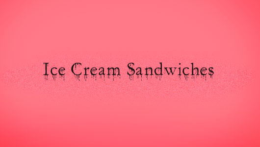
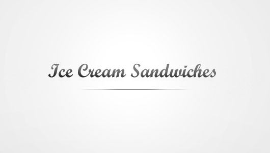
Some fonts can cause an emotional response from those who look at it. While one font may make something seem appropriate and match the context, others may make the image feel menacing or urgent. Something as innocent as "Ice Cream Sandwiches" could take an ominous feel if the font looked like it was written in blood. It may be great for a Halloween motif, but in a general sense it may be too much.

3. Class and Taste


Ways that Fonts Can Enhance an Image

If you are trying to target a specific class of people, using fonts that signify upscale design would be more ideal. A cursive or hand-writing type font could provide a sense of style and class to your product. Some may go so far as to saying that the product could be "fancy".

4. Regional Typeface


Ways that Fonts Can Enhance an Image

Every area in the world has a specific typeface that tells a story of its origins. In the United States, Times New Roman is the common font the states who the people are.

Eastern-styled font

An Eastern-styled font as in the graphic above makes those looking at it feel like the ice cream may be exotic as it came from the Eastern parts of the world. Even though it may not be true, the font style used is what gives us that impression.

Your text could mean something far different to the viewer than what your intentions could have been. Different styles of fonts can invoke different emotions and reasoning in the one reading it. Choose your fonts carefully to make the greatest impact your text could provide for your image. If you'd like to find the perfect font for your project, click here to visit 1001fonts.com.

Awesome Fonts for Your Wordpress Blog!

Awesome Fonts for Your Wordpress Blog
Bored with blog's default fonts that looks very ordinary? Obviously you want to be able to set them according to your choice.

Awesome Fonts for Your Wordpress Blog

Changing fonts in WordPress.com blogs


Steps to take when you want to add fonts on wordpress.com is to use CSS for faster system. For a more detail on how, you can search through search engines because there are already a lot of tutorials that explain how to add fonts to the default Wordpress themes. I would suggest this one: Playing With Fonts

Going with one that is a bit different and attractive, is really a great way for you to get your work to stand out, so we thought we would share some unique and cool font references only.

The Awesome Fonts!


LORENA | DOWNLOAD


awesome fonts

Lorena makes your writing more interesting! Suitable for use on the website with an elegant and simple theme.

RBNo2 | DOWNLOAD


awesome fonts

A slim and tall font. Suitable for a wide range of websites such as portfolio website.

ARVIL | DOWNLOAD


awesome fonts

If RBNo2 is a slim and tall girl version, Arvil is arguably the guy version. :P

Homestead | DOWNLOAD


awesome fonts

Slightly formal yet stylish.

WESTON | DOWNLOAD


awesome fonts

Western-style font.

FFSero | DOWNLOAD


awesome fonts

Suitable for those who love to write a solid article. These fonts make it look attractive and neat.

Minaeff Ect | DOWNLOAD


awesome fonts

This font type is usually suitable to headline a product.

Haymaker | DOWNLOAD


awesome fonts

Country-style font

Well apparently there are a lot of stylish fonts. What is your favorite style?

Integrate Fonts Into Logo design

Integrate Fonts Into Logo design
Lately, I've been getting many emails from fellow designers asking for suggestions on designs they're working on (which is usually a Company Profile or Identity Design). Many are asking questions that do not have a simple or short answer, such as "which font looks best?" I’m sorry to say I just can't help you determine which typeface looks best without the design approach.

Integrate Fonts Into Logo design

These questions got me thinking, I had to analyze my approach and try to find answer. Apart from the answer, explanation was also very important. And now I'm finding ways to redefine and rethink the way I design, the way i make a choises, so here are some tips and methods I have outlined to assist you in determining typeface to be more relevant for a logo as well as to improve your typography decisions.

Integrate Fonts


Know the History of Font Making


"Is it necessary that you know the history of font making and text?" "Is it necessary that you know when to use a sans-serif or a serif font?" The answer would be yes. Choosing an appropriate and relevant font to the logo design starts from the basic understanding of the history.

Know the History of Font Making

A good type designer / font designer are not only merely create beautiful fonts, but the typeface itself is designed to fit on a particular era or style of contemporary and fits in a specific medium. Instead of telling the history of typeface, here are some articles and books for further explanation and learning.


I'm not saying that you need to know to learn all the things contained in the article about any tipeface there, but doing some homework will take you to a way which takes considerable time in choosing the best font solutions for your logo design.

Get a Feel of the Curve and Shape


Next time you select a font, try to zoom (zoom in) and then analyzes the curves and shape of a writing sample.

absara and bienetresocial

Let us compare the lowercase letter 'A' on FF Absara and Bienetresocial (free font); letters A to Absara typeface has a sharper curve and straight in comparison with Bienetresocial which has a circular curve (rounded). Letterform Absara writing-carved look to emerge, while Bienetresocial look more fluid and smooth.

So what can be done by knowing the above when determining the typeface of a logo? Well, a logo design with drastic angles and corners will probably look better when paired with Absara, because the expression tipeface Absara way more noticeable characteristic that represents the logo, while the logo design that has a typical circular or obtuse angle would look better when combined with Bienetresocial.

Also, many logo designers will redesign or modify an existing tipeface to get a logo blend with suitable feel.

Characteristic


Just like when you define music, car, or home design, it must be in accordance with your personality right? Now let's look at the Public Gothic (free font). As the designers stated that the character is 'industrial or slightly vintage'. Now let's look at the use of Public Gothic on the proper use (not related to the logo, but for the purposes of the example).

Below is the website of Happy Cog'aoke, designed by 'Happy Cog', is using Public Gothic as the masthead (the head of the newspaper or headline) Happy Cog'aoke them.

Happy Cog'aoke

Typeface or design elements on their website areas compliment each other well. Characteristics 'industial vintage' of Public Gothic texture goes well with the background and used a line similar to the circuit box on the website. A winning combination of a great overall look of the website.

Think about the look / taste-display and feel of the market, your client's target market, and the overall impression that you're trying to give through your logo and then combine it with the characteristic / personality type font (including puns in it). If you are in conditions that do not allow you to specify keywords that are similar among the target market, sign / symbol, and or tipeface then there must be some place-something that needs to be adjusted, removed and modified. Actually this is the purpose of graphical knowledge.

Contrast


Contrast is important in a design, it gives the differences and emphasis where it is needed. Try to incorporate the sign or form a thicker-more striking with a thinner tipeface to add atmosphere, space and or emphasis.

For example, a new identity for Armani Exchange (A | X) using a combination of thick, solid, and firm square with a tipeface that has good contrast with the thin lines to add contrast to the emphasis areas of squares and lines thicker to add a niche the black square.

armani exchange

It is also a good example of an emphasis on shape and form, as a thing straight, long and horizontal, Serif standing perpendicular to the line of the square. Which brings us to the next point in common.

Similarity


In contrast (again, including puns) in the above, try to balance the weight of the tipeface logo mark that has been selected to create a stronger relationship ties.

Let's look at the following examples Exact identity. The lines on the symbols 'equals' (=) as thick as the thickness of the form letters in the word 'exact'. This creates balance and relationship between the two design elements are separate from each other and work to bring them together. Instead the emphasis we now have the element of uniformity.

exact

Readability


When designing for any medium or subject, you should not let a style blocking design. More important, the style should not hinder usability, and in this case is the readability of a tipeface.

Readability

Choose a logo that is not only good to use on the large size, it should also excellent in a small size. Make sure it looks perfectly fine in 18-point font size on your screen, but remember that the logo is often placed at a narrow corner or on a business card, it requires the ability legibility at very small sizes.

When testing a tipeface, do not forget to shrink their size on the screen as an additional step when printing them on the small size. If it's hard to read it is probably not the best solution.


Finally, two thoughts


Contrary to the above, according to the basic principles - a logo should not be made based on a sign or symbol. Many of the most successful logos are those that use paper-based logo (logotype) that is memorable and wonderful, featuring tipeface or custom design type.

Secondly, the integration of the logo typeface is not only associated with the logo and symbol mark. Many of these tips above can also be used in all these forms of typography-to determine the headline for an article, for example, is a technology or a way to determine the hierarchy of a bird-themed books.

Not to say that you should start designing tipeface or simply knowing how to identify each tipeface on the market, but to have a strong understanding of typography, rules, and history will take you and the results of your design on a long journey.
 
Support : Creating Website | Johny Template | Mas Template
Copyright © 2011. Tutorials Blogger - All Rights Reserved
Template Created by Creating Website Published by Mas Template
Proudly powered by Blogger