One of the most essential parts of Environmental Graphic Design is a Sign System. Sign System is a series of visual representation and graphic symbols intended as a medium of human interaction with the public space. Sign-divided into four categories, including:
1. Traffic Sign
Sign commonly used on public roads as driving instructions.
2. Commercial Sign
Sign aiming as the name of the store or place of business.
3. Wayfinding
Commonly found in buildings, or public area that serves as a guide or a pointer towards various facilities.
4. Safety Sign
Sign for safety instructions. Commonly used in the building construction area.
Another point to be considered in Environmental Graphic Design is clear and precise communication to convey a message, it must be able to act as navigation, information, branding and identity as well. Environmental Graphic Design is now merging the existing boundaries between architecture, graphic design, sign, public art and advertising. However, Environmental Graphic Design is not merely act as an information or guidance only, but it also must look attractive and eye catching. As we know that with the right combination of typography, color, shape and material can produce a strong sign in terms of both visual and message, or information.
We will be showing you 40 Signage/Wayfinding & Environmental Designs. We will be made aware of how designers incorporate a mix of modernity and culture in some of the designs. Here are the photos:
40 Beautiful Signage / Wayfinding and Environmental Design Examples
1. Sifang Art Museum via Foreign Policy
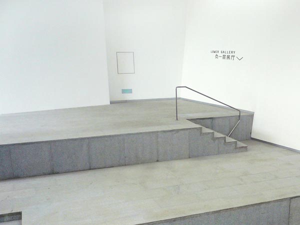
Set within the gentle terrain of Laoshan in Nanjing, the architecture of Sifang Art Museum is a well-constructed mix of harsh angularity with an elegant appeal whereby the asymmetrical structure hovers in space. Every view angle yielding a different trapezoidal perspective; the collateral system adopts the trapezoidal form. The Chinese saying - Strength within Gentleness - is inspired by bamboo - the material and form used for landscaping and parts of the structure. This underpins the brand identity, describing the gentle landscape where in old China, scholars and artists took recluse to master their craft or refine their thinking. The demure that also balances the masculinity of the architecture. White, is also a canvas a museum would function as.
2. First Choice Liquor Stores via David Popov
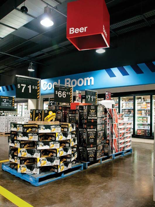
Environmental and wayfinding/signage design for a large liquor store chain
3. Wayfinding Westerdals via Marius Holtmon
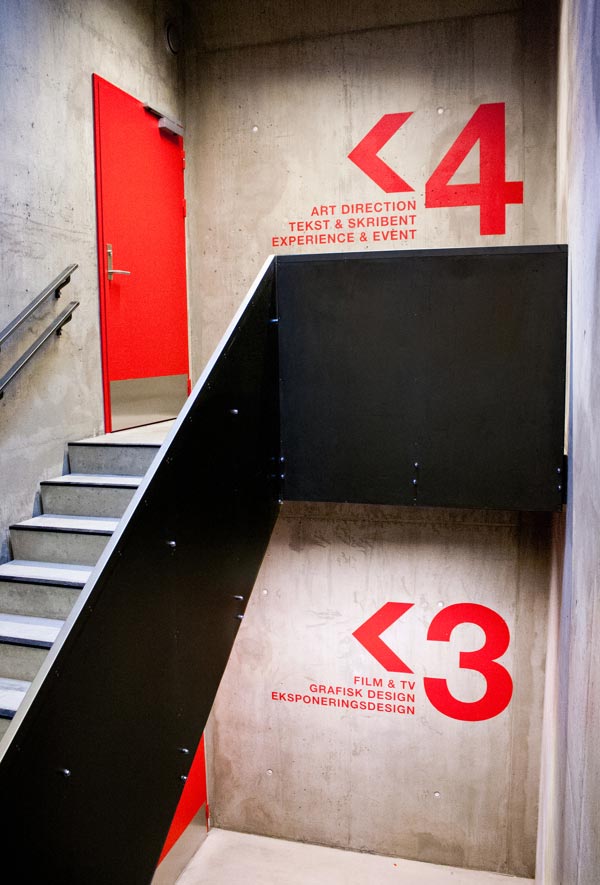
Wayfinding Westerdals Signage and environmental design.
4. Poziom 511 Signage via Jarek Kowalczyk
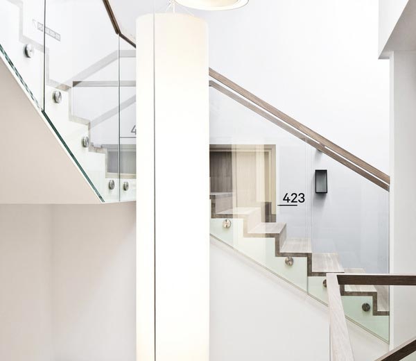
Wayfinding system for a hotel.
5. DaySpa via Olof Bruce

Visual identity for DaySpa, a new spa concept in Stockholm, Sweden.
6. Hospital de Braga via Rui Granjo

Through associating the striking ethnography and some of its most emblematic features, together with elements immediately recognized as health care, the logo dictated a strong human and emotional communication scheme that not only reinforced the spirit but also its local heritage of the north of portugal.
7. Mediateket via Madeleine Skjelland Eriksen
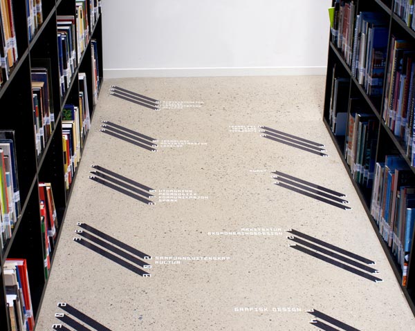
Mediateket Library Signage and wayfinding.
8. Esade’s Colors via TwoPoints.Net
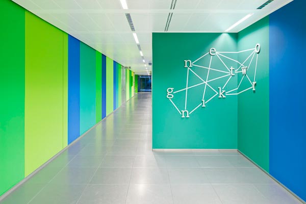
Typographic installations.
9. Bota Bota - branding via Gabriel Lefebvre
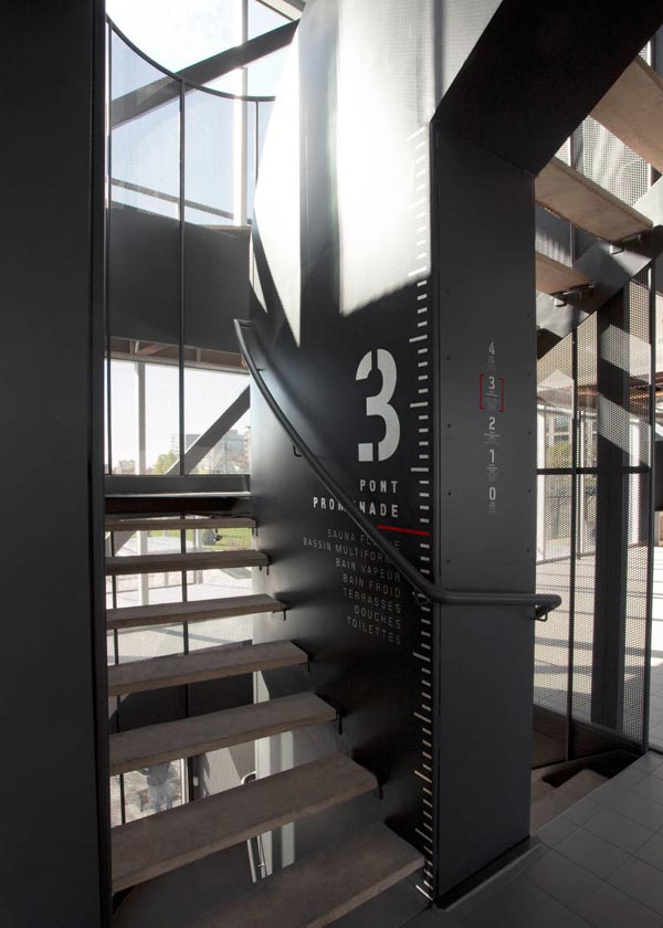
Branding, Signage, Art Direction.
10. GRK via RED ANTLER

Branding and design for a restaurant
11. Revolver Coffee via Post Projects
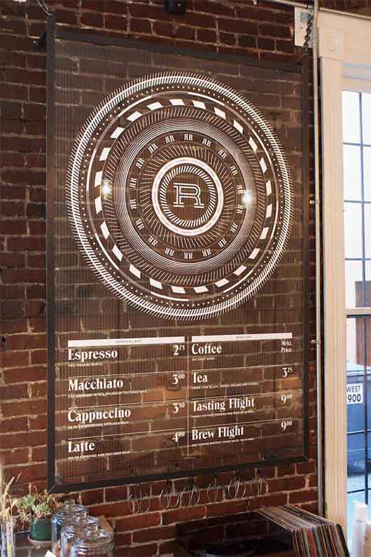
Visual identity for coffee shop.
12. Suite. via Modik
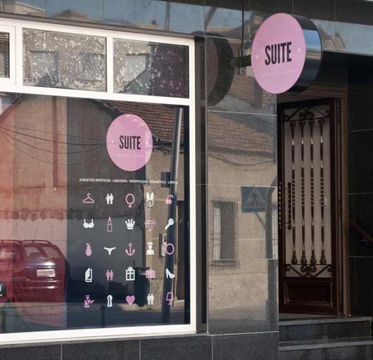
However, not talking about a room anyone, but a Suite, which leads us to a special place, a spacious, luxurious, sensual. The target of the naming of the brand and logo is to represent the erotic in a way implicitly suggesting and playing with imagination.
13. Paralelo 19 via Luiz Abreu
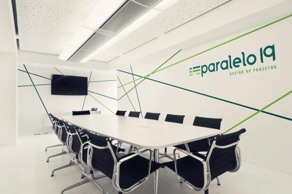
Visual identity, stationery, signage and institutional parts for Paralelo 19.
14. Hospital signage via Jarek Kowalczyk

Wayfinding / signage for a hospital.
15. 3D Neon / Lights Off via Rizon Parein
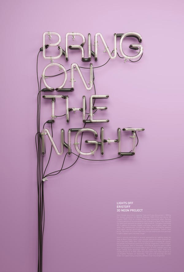
Neon headline visuals made for an Eristoff vodka campaign (personal executions).
16. Regent Park School of Music via Bruce Mau Design
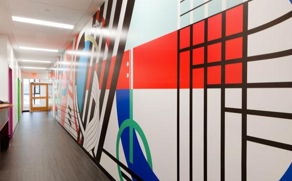
Branding, Environment design of The Regent Park School of Music.
17. Brooklyn Museum via 2x4
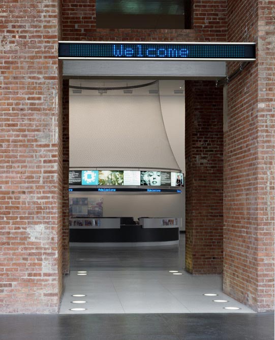
Environmental Design, Signage of Brooklyn Museum.
18. Target Branding via Allan Peters
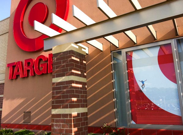
Target Branding. Ads, Billboards, Exterior and Interior Signage.
19. Casarès–Doisneau schools in Saint-Denis via Jérôme Mignot
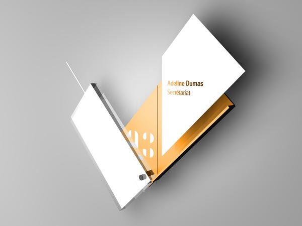
Signage of a new elementary schools in Saint-Denis.
20. Shop Before The Shop via Fivethousand Fingers

Signage of a mobile street vendor.
21. Natural Science Museum of Barcelona via Jordi Huaman
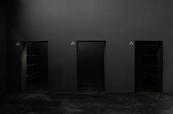
Signage for Natural Sciense Museum of Barcelona.
22. ENSA Paris-Belleville via Jérôme Mignot
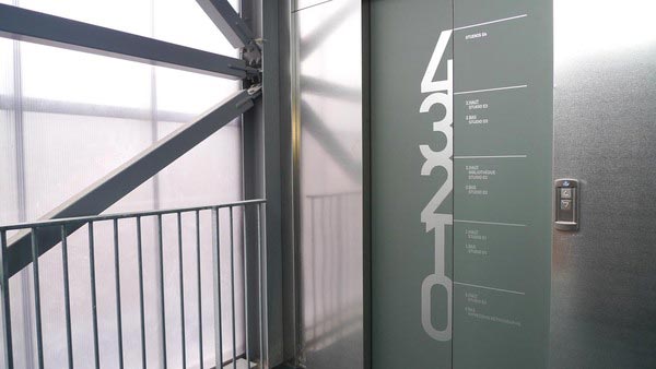
Signage & Wayfinding for the ENSAPB.
23. Cycle Kids, Breakaway via Bluerock Design

"Cycle Kids promotes healthy lifestyle choices by introducing kids to the joy of bicycling and educating them about bike safety and nutrition. This non-profit group empowers children to develop positive, safe, and active lifelong habits. The Breakaway event is an annual fundraising ride for this Cambridge-based non-profit. The logo is a hand-rendered script that was modified to elevate the event to a sophisticated level. Items included, naming, logo development, cyclist jerseys, t-shirts, water bottles, tickets, rider booklet, signage, website, posters, and more. Project created at © Weymouth Design."
24. User experience for a school library via Simen Strøm Braaten

a wayfinding system for the library at Deakin University.
25. CAC Signage System via BOSCO
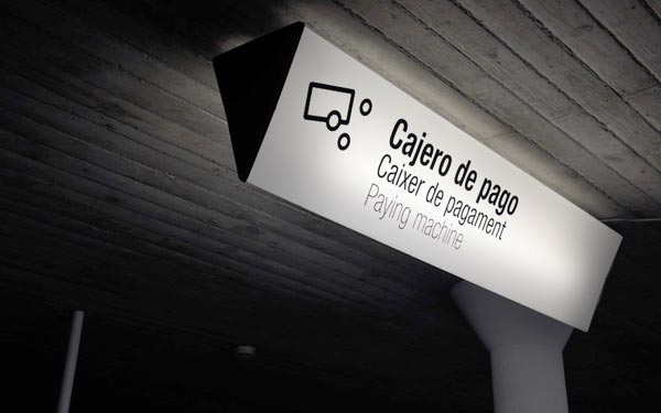
Signage and environmental graphics for Ciudad de las Artes y las Ciencias.
26. Stadtwerk Lehen - signage system via Renzler. Design
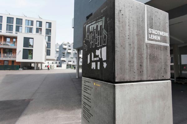
Signage system for Stadtwerk Lehen in Salzburg.
27. Black Dog Retail Store via Matt Hammond
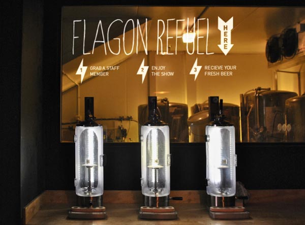
Black Dog Brewery retail store concept, design and application across various touchpoints.
28. Chicago Design Museum Way-finding/Signage via Pouya Ahmadi

Way-finding and signage for the first exhibition curated by Chicago Design Museum featuring works of VSA Partners, Ed Fella, Debbie Millman, etc. The design theme evolves around the idea of simplicity and transparency.
29. Parque Moinhos de Vento via Eric Pautz
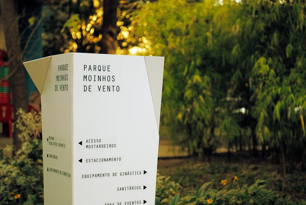
Signage elements of one of the most important parks of the city.
30. Eleni's NYC via RED ANTLER
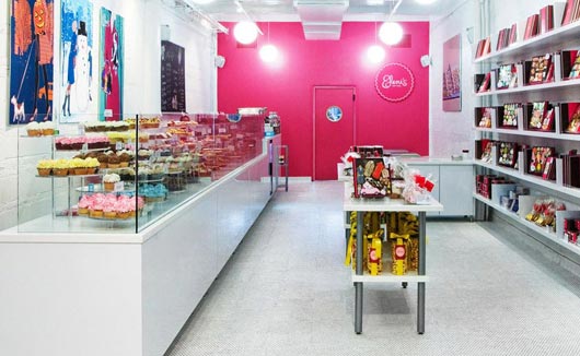
signage of a bakery.
31. PM24 via CIP Creative
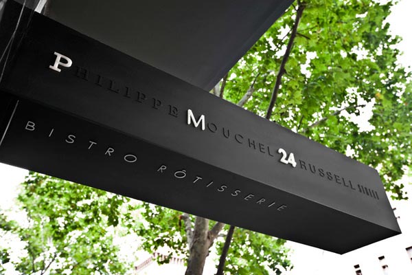
a contemporary yet sophisticated bistro style identity that flowed through the menu and signage.
32. City of MULHOUSE via Jérôme Mignot
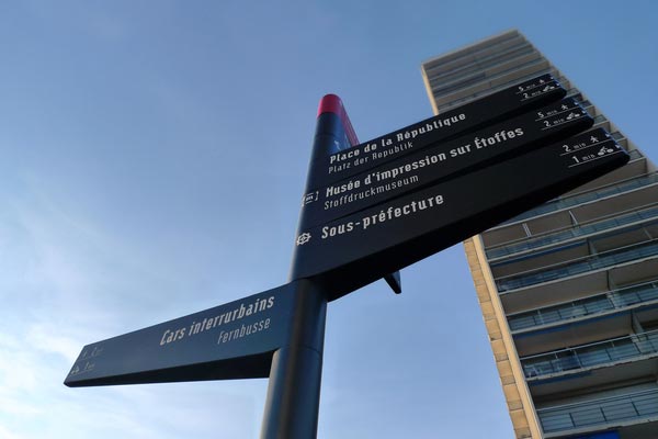
Signage and wayfinding of the city of Mulhouse.
33. Buenos Aires Wayfinding Sistem via Luciano Balzano
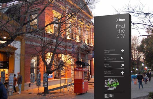
Buenos Aires City Wayfinding sistem.
34. 2011 Lumens Signage via Bildi Grafiks
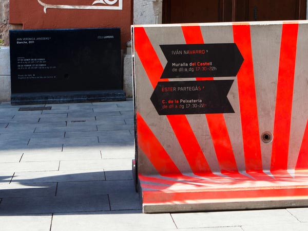
Signage system for 2011 Lumens, a show that brought together a dozen contemporary artists who were commissioned to work with light.
35. Signage system | “Chasopys” creative space via Igor Skliarevsky
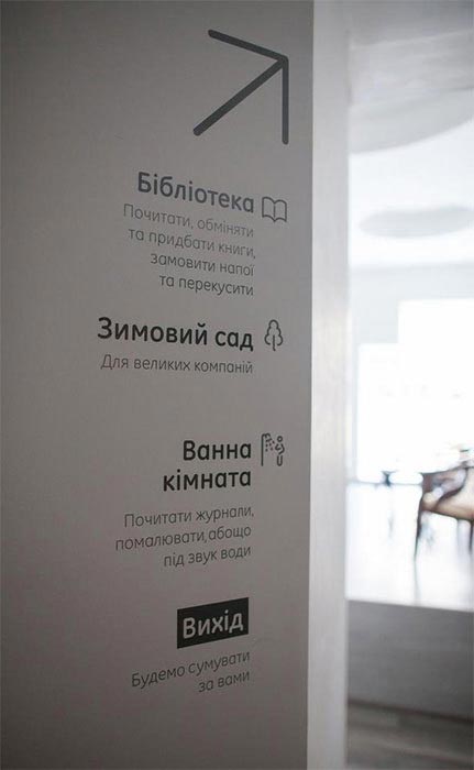
Wayfinding and signage system for “Chasopys” Creative Space in Kyiv, Ukraine.
36. Abbaye Du Thoronet via António Queirós Design
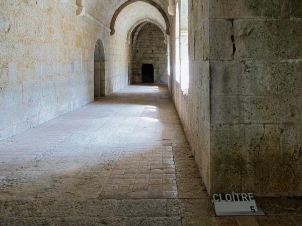
Typographic instalation, Signage project. Aluminium 1 cm pieces, water jet cuted and blended.
37. Simone Veil Hospital via Jérôme Mignot
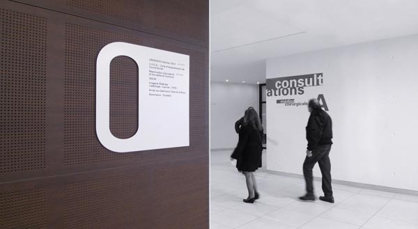
Signage & wayfinding for an hospital in Paris.
38. Aquatics centre - Châteaugiron via Jérôme Mignot
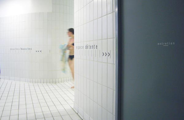
Signage for the the aquatics centre in Châteaugiron.
39. Mango Financial via Bercy Chen Studio
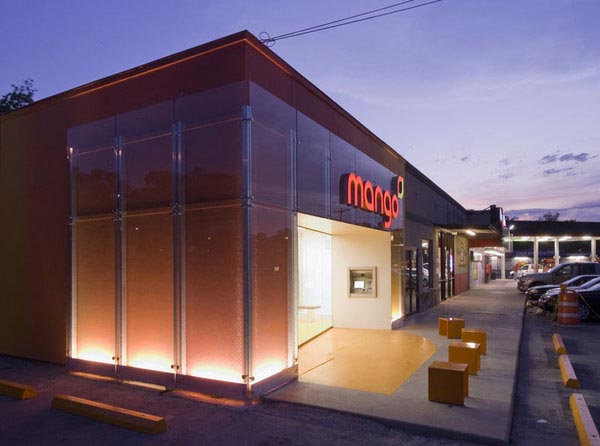
Signage with a vibrant logo and night lighting.
40. SK Telecom 'T' Signage via totalimpact
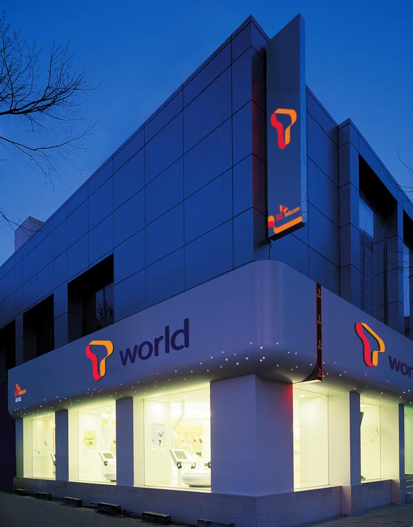
The signage system and retail store design also adapted the same visual concept for consistency and applied soft curves and clean graphics to provide comfortable environment for customers and enable them to enjoy T’s service. Through this project we not only successfully renewed T’s BI, but also created a holistic strategic identity that applies consistently to space, advertisement, prints and everything else that reaches the customer.