Logo in its role as an identity certainly not enough to simply rely on the view form that is aesthetically attractive, but it also must have a meaning and philosophy that will make it unique and different from others. Philosophy and the meaning of a logo sometimes not be expressed clearly. Corporate logos below are good examples in conveying meaning and philosophy are hidden, so that it remains intriguing and memorable for those who see it.
Amazon.com

At first glance, nothing strange with the Amazon logo. But look more closely, the yellow line curved into a smile that turned out not only as a symbol of the smile, but also as an arrow that connects between points a and z. A philosophy that amazon.com is an online store that has a lot to be sold from a to z.
Fedex

Fedex logo is one of the most famous logo with a hidden symbol. The arrows are formed from the merger of the letter E and x is perfect. The logo designer has been to maximize the negative space of typography very well.
Toblerone

Toblerone is a chocolate manufacturer from Bern, Switzerland. Bern is also commonly known as "The city of bears", it is a city with lots of bears. They have been applying these ideas in the Toblerone logo. If you look closely you'll see the silhouette of a bear standing on two feet on the icon of the mountain.
Formula 1

another logo that utilize the negatife space intelligently is the logo of Formula 1. We will find the number 1 seen between the letters F and red stripes. In addition to using hidden symbols, the logo is also quite good in communicating the feelings of "quick" in appearance.
Continental

Continental is a company that manufactures tires. At first glance there's nothing interesting about this logo before we finally found out that the letter C and o form a symbol of tires in 3-dimensional perspective.
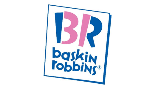
Baskin Robbins

Baskin Robbins logo appears along with numbers 31 through a combination of contrasting color. What is with the 31 for Baskin Robbins? Apparently, 31 is the number of taste BR offered to consumers.
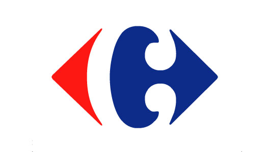
Carrefour

Carrefour is one of the largest retail company in the world. Carrefour logo seen as two arrows in opposite directions, and in the middle, we could see the letter C look pretty as a negative space.
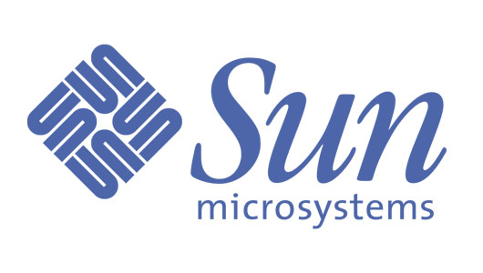
Sun

This logo is very unique, its ambigram. Where in each direction, we can read the word sun. Sun logo was designed by professor Vaughan Pratt from Stanford University.
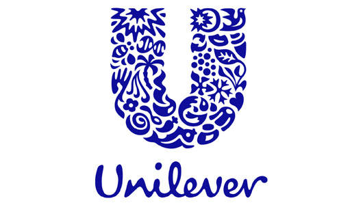
Unilever

Unilever logo consists of a set of shapes adjacent to each other and form the letter U. But it turns out these forms has its own meaning. For example: heart shape symbolize love and affection, the bird symbolizes freedom, etc..
NBC

As one of the largest television network in America, everyone would have been familiar with the logo of NBC. Icons on the NBC logo is a colorful 6 tailed peacock, , it symbolizes the 6 divisions owned by NBC at the time the logo was created. Peacocks are also seen to the right, indicating a significant forward movement forward, and not backward, which means deterioration.
Vaio

Sony Vaio has been known as a laptop brand. But did you know? that the Vaio logo is a typographical symbols that mean something? letters V and A represents a simple basic form of motion signal, while the letter i and o are similar to numbers 1 and 0, which is a symbol of the signal in digital format.


