"Unity is an element of continuity that is formed of several elements that look harmonious and united in a work". Unity is a very important element in graphic design. And In the terms of branding it's been mentioned that Unity can build up a strong character, it can also make a difference so it can bring a deep memory of products and makes it stand out.

A small example for instance: Consider some of the leading corporate branding which use only a minimal color as their brand, and they tend to repeat it in their various business tools, such as stationery, to the building exterior coloring matter .
Unity creates a feeling of wholeness. Unity is usually achieved when the parts complement each other in a way where they have something in common. Unity can be achieved by use of the same color, or different tints of it, or using a similar graphic style for illustrations. - Wikipedia
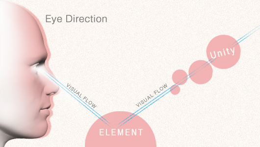
Eye Direction

Unity makes a design flow easier to catch-up so as to achieve the expected target of a design. For example: a brochure that promotes all things of beauty would be right if it is formatted neatly into an element of unity in pastel colors. You can start with the use of monochromatic colors with the orange base color. Even if the brochure is well-desined, visual reader would get the impression even before they begin to read the details.
Forming a Unity
There are mainly three things to consider when forming a unity in a work.
Proximity
Proximity is one of the simplest ways to form the unity. By bringing certain elements with one another to define it as a group, and provide enough distance for elements other than the group.
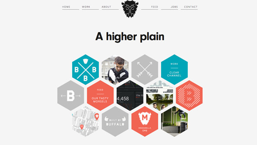
Here's an example of proximity in a web design (source:builtbybuffalo.com):

Website above is a great example of the proximity to create unity. The elements of the site is neatly divided between one another. The closeness between the thumbnails, and a short distance with other elements such as menus create a separate entity for each element. And those hexagon elements are creating a unique website character. It makes the site visitors will be easier to use navigation, they can easily creep from one page to another as easy with a neat groupings in the Web.
Repetition
Repetition is another way that can also be used to create unity in design. You can use your creativity in repeating some graphic elements that are commonly used as repetition, they are:
- color
- shape
- line
- texture
- objects
Here's an example of repetition in a brochure design (source:behance.net/Salma-Skaik):

Brochures above have a strong unity through repetition are represented by different graphical elements, such as color, geometric elements and fonts. Another example can be found in the general magazine layout design. Typically, the design on the same theme will have a strong feel of repetition in the form of colors, textures, fonts and shapes. It is easier for readers to find out if they are in the same section of a magazine or if they have switched to another.
Continuity
Continuation formed when an element successfully visually guide your eyes to lead to other parts in a design. This method also makes the design look well-organized, it creates visual continuity and guides the reader in following the flows you want to convey.
Here's an example of repetition in a logo design (source:hotelassociation.ca):

A curved line on the letter 'H' formed a direction that points to a leaf element. Our eyes as if guided to look toward the leaf element.


