
Here I brought to you the 35 Well-Designed Alcoholic Packagings, the following alcoholic packaging designs are very interesting, some of the packaging has the strong elements of typography, some also has a variety of shades and colors which are very inspiring, as well as some packaging that is designed with a minimalist theme. Enjoy!
35 Well-Designed Alcoholic Packagings
1. Finca de la Rica Designed by Dorian
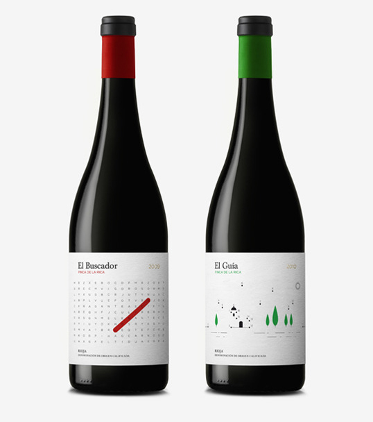
“El Buscador” and “El Guía” are the first two wines from a line designed under the concept of leisure. The packaging focuses on the moment of relax and pleasure that gives you with a good glass of wine, through a fun and original label that invites consumers to participate directly on the bottle itself to complete or resolve the puzzles.”
2. Marx Wine Designed by Marx Design
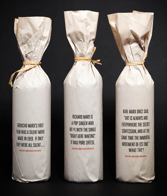
“Marx is such an unusual name that new clients tend to get us confused with the other lot – Richard (pop singer), Groucho (the comedian) and Karl (the communist). We wanted to clear the confusion once and for all with these light-hearted promotional pieces that establish (Ryan) Marx design as a unique identity (and go down well!).”
3. Magnus Henriksen & Amandus Bjerk Designed by Magnus Henriksen & Amandus Bjerk
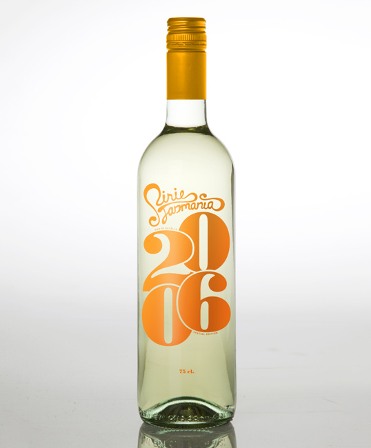
“Pirie Tasmania is a wine producer located on the northern part of the Australian island Tasmania. The environment surrounding the vineyards are a beautiful mix of mountains, forests and rivers.
The typography-based decoration is inspired by the organic environment surrounding the vineyards.”
4. Courthouse Brewery Designed by Timothy Batterham
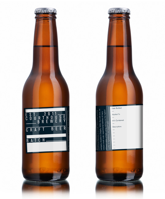
“Courthouse Brewery is an extremely small, family run brewery run out of the old Courthouse situated in Dalgety, NSW. While currently only brewing reasonably small batches for distribution amongst family and friends, the brewery has the capabilities of brewing on a far larger scale for commercial sale. The brewery wanted to create branding that could be used across all of their products as a generic label for the beer they brewed.
My solution was some branding that was, for convenience, printed on packaging tape, and could be cut and fitted to the individual bottles or to boxes of the beer for storage or distribution. I designed a generic label that could be used across all of their different brews and filled in individually or with another label in case they ever felt the need for the extra information for sale or storage purposes.
The branding concept was designed to communicate the same “fill in the blanks” idea that the labels were based on. This idea also communicated the kind of personal attention given to each batch of beer they make and shows the personal love and care this family has for their brewing.”
5. Punch in the Face Designed by Cactus Restaurants Ltd.
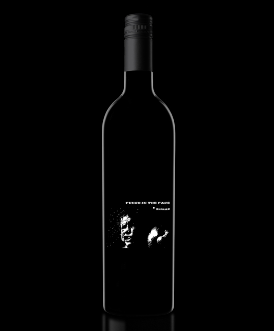
“The wine is produced by R Wines in Australia exclusively for Cactus Restaurants based in Vancouver, BC. The name and label easily sums up what the wine is all about… big and bold, over-the-top and HIGH in alcohol.”
6. Vi Crossos Designed by Atipus
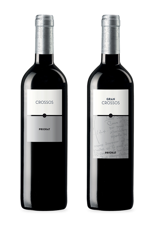
More wonderfully simple label design and architecture by Atipus in Barcelona, this time for Vi Crossos.
7. McLaren Vale Beer Company Designed by Parallax Design
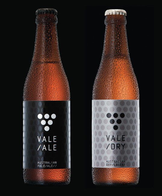
“Vale Ale was developed to position the beer from one of Australian’s premier wine regions as a completely new, contemporary and different brand to the category norm. To quickly get noticed, Vale Ale had to claim its own brand space immediately. It is now joined by Vale Dry, and McLaren Vale Beer Company is the fastest growing beer company in Australia.”
8. Morse Code Designed by Parallax Design
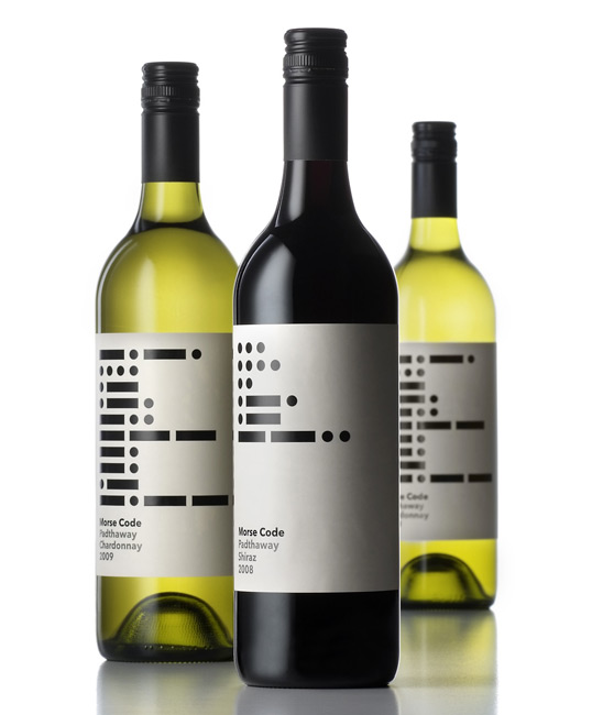
“Henry’s Drive wines are branded along a postal theme. The Morse Code range pays homage to the first electronic mail system. The varietal of each wine is printed on the label in morse code.”
9. Clare Red Designed by Parallax Design
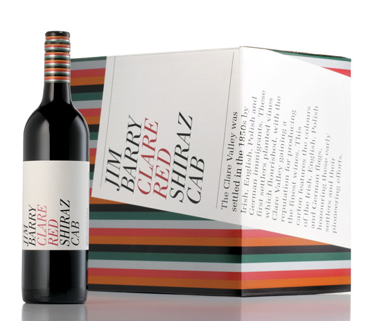
“The Clare Valley was initially settled by Irish, German and Polish immigrants. Today, The Clare Valley is one of the worlds greatest wine regions. Jim Barry Clare Red honours these settlers, the colours of the Irish, German and Polish flag printed on the capsule and carton.”
10. Lodge Hill Designed by Parallax Design
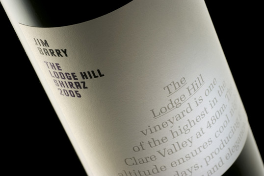
“Jim Barry purchased the Lodge Hill vineyard in 1977, as he was sure it would “produce some of the best Riesling in Clare.” Situated on the eastern ranges of the township of Clare, it is one of the highest vineyards in the Valley at an altitude of 480 metres, and is ideal for producing steely, minerally Rieslings, distinctive to the area”
11. Karen Liong Designed by Karen Liong
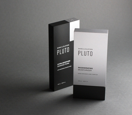
An extremely high level of craft and production has gone into this conceptual work from Academy of Art University student Karen Liong. “The assignment is to conceptualize a skin care line for an existing brand that is currently not on the skin care market. Students are expected to understand the company philosophy, target audience, and overall brand aesthetics. The deliverables include seven skin care items and a point-of-purchase display. During the research, I discovered that people who purchase Bang & Olufsen products seldom seek for merely its technical quality, but also the design, user interaction and emotional appeal. Pluto skin care is targeted exclusively towards the high-income sector and design-savvy men that are 40 years old and above. The skin care line aims to deliver mostly everything a man could ever desire: character, charisma, and class. Inspired by Bang & Olufsen’s distinctive minimal aesthetics, the products rely upon basic geometric shapes to perform their function.”
12. Jaspi Blanc Designed by Atipus
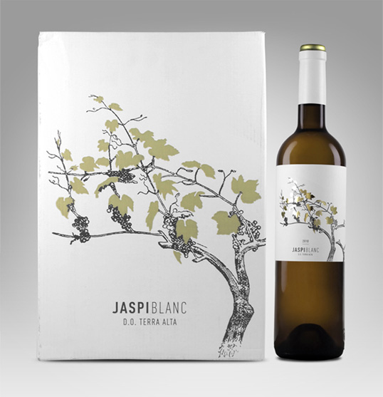
“The “blanc” is the white wine grape variety of the Jaspi collection.
It has a fresh character but with a touch of wood. This is what the label communicates. A classic representation of the vineyard, in the same way as in the rest of the collection, but in this case taking special attention on the leaves to give to the label a touch of freshness and color.”
13. Alfaro Designed by Dorian
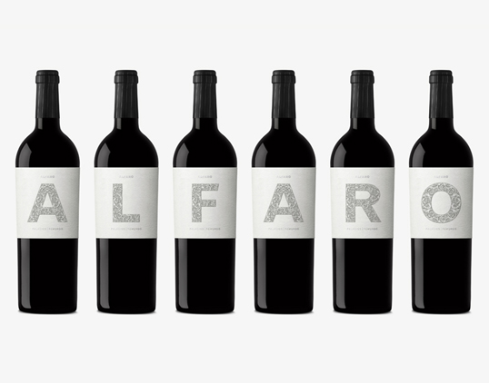
A tribute to the land and its symbols through a collection of 6 labels for each wine, that focuses in the name of the city illustrated with baroque ornamentation inspired in the altar of the “Virgen del Rosario” from the “Colegiata de San Miguel”, which is the symbol of the Riojan Baroque and the center of the event activities.
14. Alturia Designed by Menta
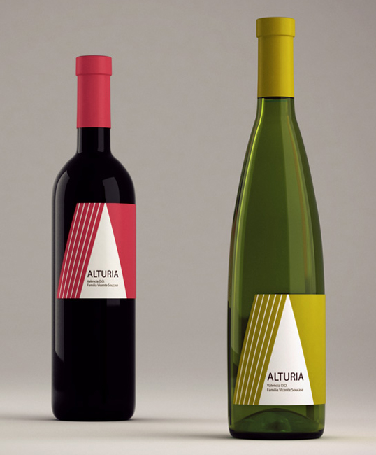
“Alturia, from Alturia Wineries, is a white wine which focuses on native white varieties from Valencia.
The approach with which we designed this label was the rediscovery of the traditional Valencian ‘barracas’ (traditional houses of the Valencian truck garden), from a contemporary point of view.
15. 7 Plagies Designed by Redfish

“We designed this new wine family, for Photos Photiades Winery in Cyprus. Named 7 plagies (7 hill sides) after the 7 hill sides that exist in the territories, and the number 7 that according to the Pythagoreans is the perfect number because it is the sum of 3 and 4 (triangle and square)”
16. Finca Cucó Designed by Atipus
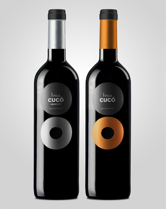
“The “cucó” is an architectural piece typical of the Priorat region. It is a stone cottage with a small entrance (in the form of an “o”), located on the cultivated land. This cottage was used as a refuge in bad weather, and also as a place to rest when the farmer have to travel between their lands.
The graphic of the wine was born as a synthesis of the “cucó” looking for a strong and attractive image, for a wine that goes to a public who love´s wine. They seek for a good value for money, but also an exclusive design for the bottle.”
17. Larisa Mamonova Designed by Larisa Mamonova
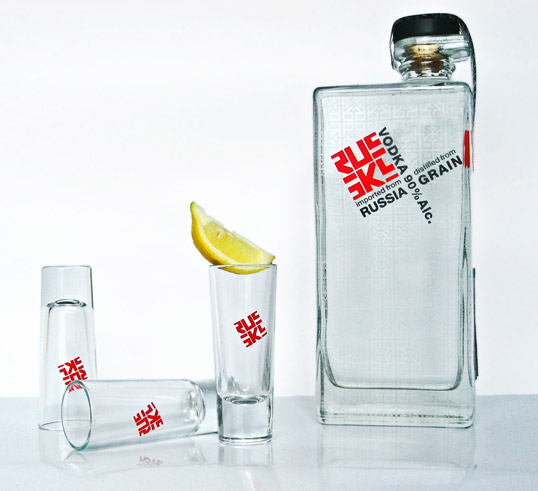
“Russky is a project for logo class where we had to come up with a hotel idea. I decided to go with Russian theme for my hotel idea. Russky would be a prestigious and luxurious boutique opening it’s location in the heart of San Diego. The hotel will have identity and branding system to appeal to hip and urban young professionals, ages 25-40. The unique challenge of this task was not to relay on stereotypical elements of Russian culture that American audience is most familiar with, instead I decided to look beyond commonly known novelties. I searched for inspiration from vintage documentation during Soviet Era, 40′s and 50′s Russian fine art, and of course propaganda posters. The key was to combine all those traditional and historical features with the clean look of contemporary design movement. With that combination of ingredients I was able to give a fresh look to a familiar subject of Russian constructivism and old world charm. Russky hotel is a history driven concept without looking dated provides an ultimate New Russian experience that is integrated into brand’s sensibility through luxurious accommodations and attention to detail.”
18. Silhouette Designed by Nosh Creative

“We designed this label in a unique way so that the metallic, paper label wrapped around the bottle and stopped just short to make a silhouette of a wine glass. The calligraphic logo was silkcreen prior to the label application. Only the type and year are mentioned on the “front”. While all other information is saved for the back so not to distract from the simple design.”
19. Ponte Romana Designed by Play Me

“This project was inspired in the Romam Bridges that we have in Beira Baixa – Portugal. Enjoy the result of Ponte Romana wine label (Roman Bridge)”
20. Foranell Designed by Dorian
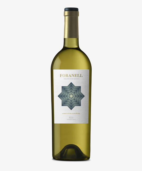
“Foranell, an organic wine with a very limited production, is conceived by the experience, effort and perseverance of Quim Batlle’s cellar. The design recreates a gateway to another world through a disturbing and hypnotic image, inviting you to discover each of the different hidden sensations of this wine.”
21. Jonah and the Whale Designed by TACN Studio
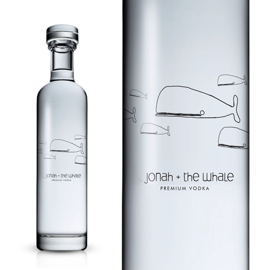
“Jonah and the Whale Vodka. Who says the bible and alcohol can’t be mixed!”
22. Frozen Ghost Vodka Designed by Levenson & Hill
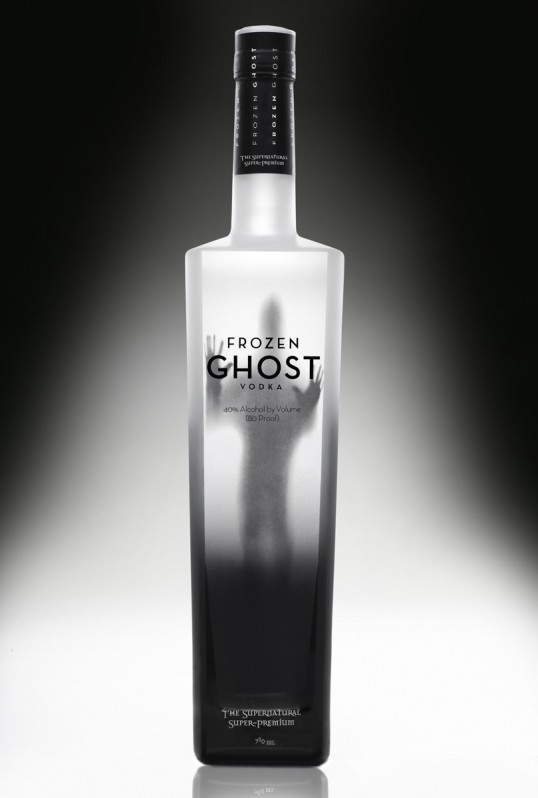
“Frozen Ghost Vodka is a new entry in the crowded super-premium vodka marketplace. Arresting packaging is vital to success in this segment, both for the bottle and the box it arrives in. This design capitalizes on what the name suggests, both eeriness and the appetite appeal of a chilled vodka with an ethereally smooth flavor.”
23. Pia Storm & Rine Boland Folden Designed by Pia Storm & Rine Boland Folden

Carl wine is an independent and family owned company founted in 1973 by Erling Carl, and currently under the management and ownership of his two sons, Michael and Gert Carl. During its more than 35 years of existence the company has developed from a one-man operation, to a business group with wine production in Bordeaux and Romania.
The Romanian low-medium prized wines are sold in discount grosery shops. The insight is that people buying wine in discount shops often know very little to nothing about wine. Therefore we wanted the help the consumer by letting the label reflect the taste and quality of the individual wine. From the cheap Merlot/Sangiovese to the more expensive Reserve and white wine.
24. Aloja Designed by Atipus
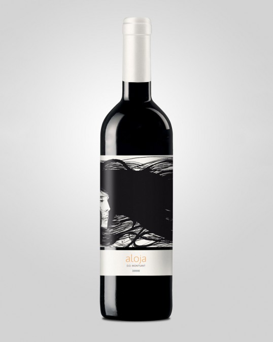
“Aloja is a sea goddess, energic but tender. The hair of the goddess involves the label creating a sinuous texture. Tasting notes: “Mediterranean character, with volume and prevalence of berries, balsamic and spicy.”
25. Cinco Designed by Diego Ballester
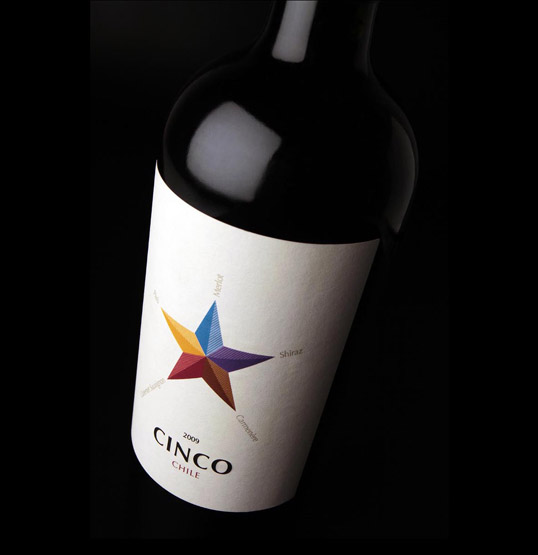
“Product created and designed for the Danish market. Five is a special wine”star” that conveys the history of Chile in a unique combination of its most emblematic 5 strains. Minimalist design, color and elegance in each of the points of the star represents a strain, with its color code.”
26. Niche Wine Co. Designed by Topshelf Creative & Geoff Vreeken
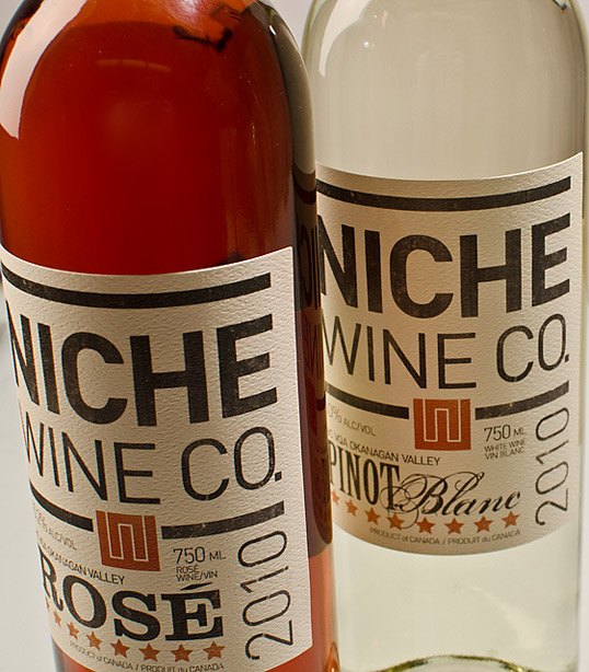
“The idea was to bring a craft beer feel to the wine category. A masculine, old letterpress approach used to demonstrate the fact that the winery is essentially a four-person, hands-on operation … much like craft brewing.”
27. Depression-Era Circus Tea Party Designed by Jag Nagra

“My friend, Angela Stephen-Dewhurst, and I organized a Depression-Era Circus Tea Party for our friends. For the 11×17 invitation poster, I illustrated 3 characters: the World’s Strongest Man, the Ringmaster, and the World’s Tallest Woman. These characters also made appearances on the wine bottles, along with a few other characters, including a fairly accurate self-portrait of myself and Angela on the Clown Label. Labels were printed on glossy 80LB text, and to add to the quirkiness of the event were adhered onto mismatched wine labels.”
28. Rubia Designed by Roberta Zanette
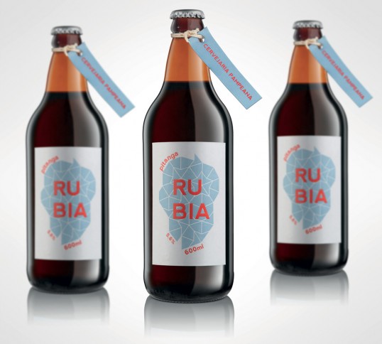
“I recently developed packaging for a Gastronomy graduate.
The objective of his final project was to create a fictitious brewery, Cervejaria Pampeana, and it’s beer, Rubia – a beer made of Pitanga, a little summer fruit from Brazil.
The concept of the project is that Rubia – a name that refers to the color of the fruit was a different beer, lighter than the others, to be consumed only during the summer months.”
29. Adir Winery Designed by Blend-it Design

“The boutique Adir Winery is located in the Upper Galilee and produces wine mainly for experts and collectors in the field. As such, we have chosen the value of contrast as a base for our work.
Gentle versus coarse, extroversion versus elegance, local versus foreign, and innovation versus tradition. The design is built from a clean, basic typographic language, that conduct a cultural dialogue emphasizing the search for balance and harmony.”
30. DANZKA Vodka Designed by Cartils
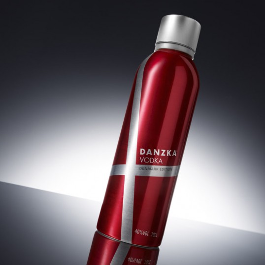
“DANZKA’s aluminium bottle provided us with a unique and exciting canvas for this limited edition design. We approached the design work with focus on typical Scandinavian design values such as simplicity, minimalism and functionality, which we feel the DANZKA brand is an expression of. The result is a collectible limited edition that we believe will have strong consumer appeal in travel retail outlets across the globe.”
31. Remix Designed by Guillo Milia
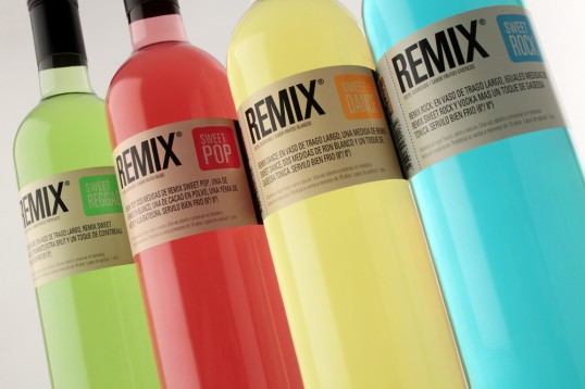
The label design for Remix packaging is inspired by an entry ticket to a concert or music festival. Both the target and the end consumers are closely related to this world, for this reason we named each flavour based on a particular musical style.
32. Auténtico Mezcal Alacrán Designed by Sociedad Anonima
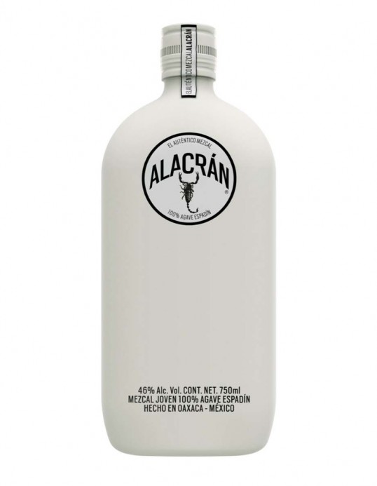
“They say that when you see a scorpion, another is surely nearby, for they always travel in pairs. Such is the case of Tequila Alacrán’s soulmate: Authentic Mezcal Alacrán.
Hand made in Oaxaca, Mexico, this pure, white spirit mixes the ancient rituals and production methods with contemporary culture.
This contradiction is, in essence, the product’s personality. Mezcal Alacrán is encased in a glass bottle with a matte white Soft-Touch coating.”
33. Buddy Mulled Wine Designed by Buddy
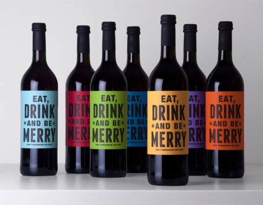
Buddy created these festive mulled wine bottles to send to their clients and friends. A limited edition of 60 labels were hand printed, signed and numbered before being sent.
34. Warm Red Mulled Wine Designed by Designers Anonymous
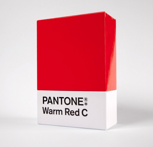
“A Christmas gift given to clients, suppliers and friends. The ‘Warm red’ Pantone chip becomes a gift box containing a bottle of ‘warming’ red mulled wine. The message printed on the bottle reads “Add a touch of colour to your cheeks this season, with a glass (or two) of mulled wine. Warmer wishes from Designers Anonymous.”
35. Emily Hale Designed by Emily Hale
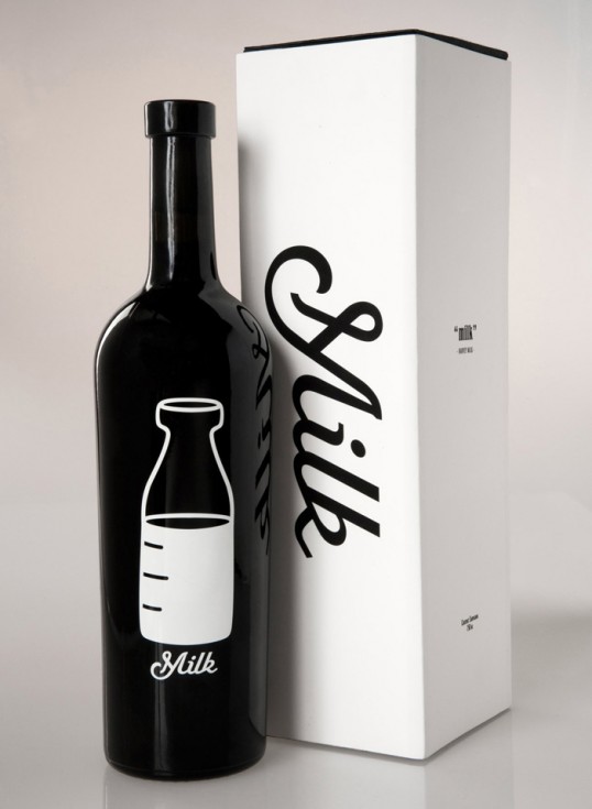
“It is a little known fact that San Fransisco boasts some of California’s best wines, much like many do not know that San Fransisco was also home to one of the first openly gay politicians in the United States, Harvey Milk. And thus, I created a wine which pays tribute to the memory of Harvey Milk.
This deep, rich, Cabernet Sauvignon has a strong backbone of tartness, as strong as the determined Harvey Milk, whom fought for equal rights in San Francisco as well as gay rights nationwide. In particular, the half full bottle of milk, represents Harvey’s positive attitude and take on life, despite his many obstacles. Seeing as Harvey was environmentally conscious, the box that houses the wine was created out of one sheet of board with no glue.
As Harvey Milk once said, “I have tasted freedom. I will not give up that which I have tasted. I have a lot more to drink.”


